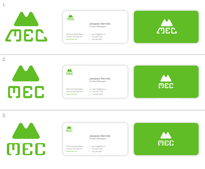
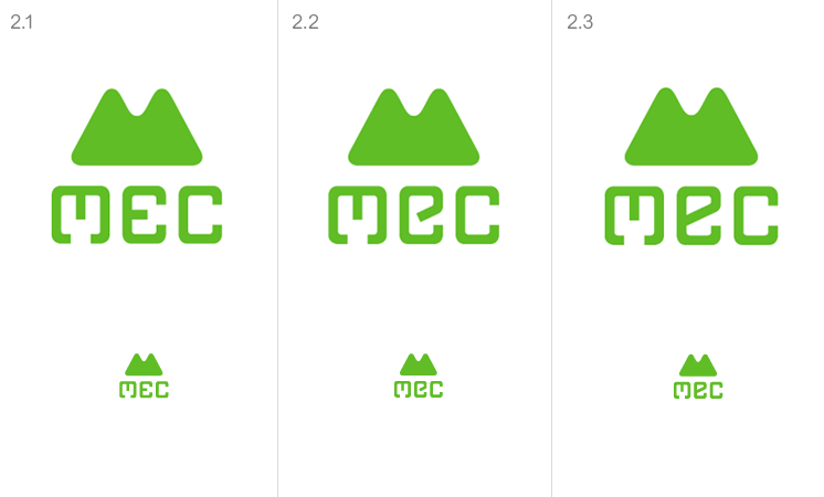
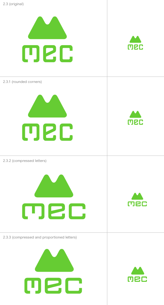
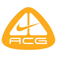
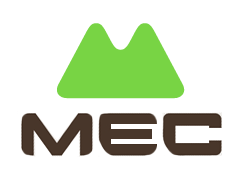
Please help me decide between these three versions. Any criticism would be greatly appreciated also.
Version #1 is the initial concept, with the wordmark letter shapes intending to resemble carabiners. The triangular shape proved a bit too awkward to work with however, and thus version #2 was conceived. To add a little humanist aesthetic and visual interest, the horizontals of the wordmark were slightly thinned for version #3.
I am worried that the initial concept might have been lost throughout this process of refinement (was it even obvious in the first place?).
MEC stands for Mountain Equipment Co-op. For those not in the know, they're Canada's largest outdoor gear retailer.
Thanks!