Typophile

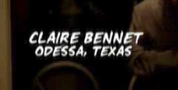
(x) Heroes TV series title sequence (credits) - Tim Sale Brush {Yves}

Stephen Coles

Looking for this comic font from the Heroes title sequence, assuming it is not custom. I have checked everywhere but Comicraft, whose site I cannot navigate.

Comic Book Inspired Fonts
P22 Pop Art Comic
Cartoon Script
Comic Pro
ComicTalk
Blambot Pro and others from Blambot
Comicraft Fonts
Le Asterix

Too Brushy
Brush 738
Arab Brushstroke
Teebrush Paint
Impress
Polka
Brody
Balloon
Okay

Stephen, I just started searching Part 6 of the Script Font ID Guide, and Britches Script caps, from Panache, seem to match the letters if you squoosh them a bit. This seems to suggest that this lettering is derived from some of the many hand-lettered film types in the pre-digital era.

- Mike Yanega

Thanks Mike.

stewf, i think all of comicraft’s stuff is on myfonts:

http://www.myfonts.com/search?search%5Btext%5D=comicraft

So then maybe it is Spooky Tooth?

http://www.myfonts.com/fonts/comicraft/spookytooth/

ChrisL

If you look at pages 88-90 in the good ol’ Solotype Catalog, you can see just a bit of the range of hand-drawn type that was available. The Photo-Lettering catalogs are full of more of them. Panache and URW are two studios that have digitized more of these than most, although I think these typefaces (many by Ed Benguiat) are a rich resource that many have ’mined’ over the years.

- Mike Yanega

Chris - not quite

Paul - thanks! missed that

Mike - true, but doesn’t this one feel a little more contemporary?

Possibly, in the sense that looking truly hand-printed is more ’now’ than in the days when lettering was done by pros whose hand-lettering looked too good to be hand-drawn.

This has a casual feel that seems almost more like pencil or chalk than a pen or brush. The way the strokes end heightens that effect.

Once again we are back in the realm of hand-printed fonts (= cheap & easy to make) and so anyone with experience in hand-lettering could have created this font.

The next question it makes you ask is ’aren’t there a lot of fonts that are enough like this that I wouldn’t be able to tell them from this one without looking at them side-by-side?’ I think the answer to that one is ’yes’.

Mike’s Rule of Hand-lettered fonts: If it’s too much trouble to find the exact match, pick a close equivalent, and get on with it.

- Mike Yanega

Found it — Comicraft’s Tim Sale Brush.

Have found a font very, very similar to the Heroes font. It’s free for personal use and you can get it here :

http://www.dafont.com/search.php?q=comic&page=2&psize=s&text=CLAIRE+BENN...

or just

Click here to go straight to it without having to copy and paste (opens in new window).

It’s Lafayette Comic Pro

All the best

Stiaan

The font is indeed TimSale Brush, and it’s available here:

http://www.comicbookfonts.com/fonts/cl318.html

and here:

http://www.myfonts.com/fonts/comicraft/tim-sale-brush/

Stephen, sorry to hear you had trouble navigating our site. I’m curious to know exactly why, or hear any suggestions you may have. Thanks.

JG

Has anyone been able to get there hands on a copy of this font?

Clark there are links to where you can license it just above you.

Comicraft is also now available at FontShop.

Aren’t the Es different?

My link was bad, Sharon. The Heroes screenshot shows the upper and lowercase (alternate uppercase) of TimSaleBrush Italic.

:-)

Captured from web.archive.org on 10 Apr 2009. view this capture