
Hi guys
BetUS.com uses this font in all of their branding. I was thinking this font was DIN at first, but then realized that the "1" was not right. Anybody know what this one is?
Some examples:
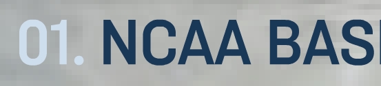


thanks for any help!
Hi guys
BetUS.com uses this font in all of their branding. I was thinking this font was DIN at first, but then realized that the "1" was not right. Anybody know what this one is?
Some examples:
thanks for any help!

Almost, but too American.

Why do you see that as American, Stephen?
Stephen, yep, getting close...looks a lot like it. But that "1" is not right yet. I went through their whole site looking for the "1" to help try to match, but no luck as of yet.
Titling Gothic as American? Not as square as this. More warmth in glyphs like the ampersand. I guess I should say "older".

There are several 'signature' elements in this font (duh!), but the closure of the C, oblong O, and the style of R are proving to be an elusive combination for me. We even see the G, M and Q, which you think would help nail it, but so far I have not found a match.
This site doesn't strike me as a place that would be getting custom font work done, so this is probably sitting out there somewhere, but so far my best (poor) match has been Ketchupa from Fountain. Most shapes are OK, but the R is wrong and the 1 isn't right. I like Ketchupa because the edges are softened, but that is also unlike the posted sample. I told you it was a poor match.
- Mike Yanega
After about a full hour researching this one, I'm betting on custom.
Custom, but based on what typeface? I am not sure I buy it is original.
If it's custom, I'm betting on Stephen's suggested Titling Gothic Narrow Medium. It seems to be the closest match.
Doing more research on this company, they are huge-huge, and I wouldnt doubt that as part of their all new re-brand they went this custom route. BUT...I am still checking around!
EXTRA EXTRA READ ALL ABOUT IT =)
Coming 'round back to this.
At last, recently I have discovered the ID of this font. I felt like a character in a Dan Brown novel unraveling the shrouded mysteries that cloak this font. Well I finally have my answer.
It's called Vibration, and its a FontBureau font, originally created for VIBE Magazine. It's not available on the site, but they will sell it to you over the phone. I hope this info helps some of you, and for those that have helped along the way, I also thank you.
Well done. Some might be suprised how many nearly faces FB have in their drawers just waiting to get put on the store shelves.
Where did you find the answer? Or did someone find you?
Thanks for coming back with an answer. Turns out I had a sample of it in my Sans Serif Font ID Guide, but I must have gone right by it.
- Mike Yanega
I thought this was going to be released publicly soon. :^/ I also thought the custom area on the site was going to re-appear.

The latest (3rd, hardcover) edition of the Font Bureau type catalog includes Vibration Gothic -- the book must have been printed during that brief period after the font was released from Vibe-sclusivity and before it was pulled from the FB site.

I felt like a character in a Dan Brown novel
You poor, poor man.
- Lex

Typophile, the right place for type identification and literary reviews. :^P
Captured from web.archive.org on 26 Feb 2012. view this capture