Typophile

OSF drop-caps?

blank

I'm working on a piece that uses the numbers 1, 2, and 3 as drop caps. I'm working in Sabon, and the rest of the numbers in the document are OSFs. Doing the same thing for the drop caps yields the following horror:
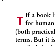
Should I try to find some method of making the OSF drop-cap work, or should I stick a tabular figure in there?

You could create a nested style sheet to correct this quite easily. You are in InDesign, right?

Yuppers, John Warnock is my lord and savior.

But hat I really want to know is what's the appropriate/traditional solution: use tabular figs, or adjust the OSF to not look silly. I don't think that I actually own any books that feature numbers as drop-caps, so I don't have a good reference.

Lining figs.

Do you have figures only for paragraph/section openers, i.c. drop caps?
What's the range, I mean, do you have also 10, 11 &c., that consist out of two figures?

In case you have figures only, you might give it a try with 'hanging' drop caps, placed into the margins and both lining with the first and resp. second or third line of text.

Try to avoid lining figs as much as possible. They are for tabular work and all caps settings (titling) only. (At least, that's my old fashioned dada.)

It's my understanding that he's only using lining figs for the drop caps, which he'll need to kern manually anyway.

Captured from web.archive.org on 25 Dec 2011. view this capture