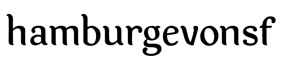
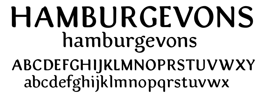
After a quick look, overall, I like it; I've always had a soft spot for typefaces that have a feeling of movement to them.
Generally, I feel like the characters aren't quite cohesive yet. The h, a, m, b, and o are for the most part smoothly curved, with the characteristic pointed stroke endings, but the r, f, t, and g (especially the g) have their smoothness interrupted by angled lines. In addition, those letters show some asymmetric sections (like the crossbars of the f and t) that I don't see on the other letters. I think you need to decide in which direction you want to take it -- toward the smooth, Sauna-esque curves of the h and n, or toward the rougher shapes of the r and g.