Hi everyone,
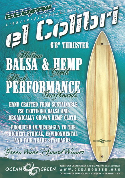
I did the logo below for this Nicaraguan/UK environmentally sustainable surfboard company a few years ago...

Now they are getting ready to go global and a makeover seemed in order.
They produce a range of hand crafted hollow balsa and natural fibre surfboards that compete in both performance and price with the usual polychemical factory boards.
Key words for the brand image include...
Environmental
Quality / Craftsmanship
High Performance
Classic / Timeless
Slightly Retro
Stylish / Cool
So is this new version better than the old...
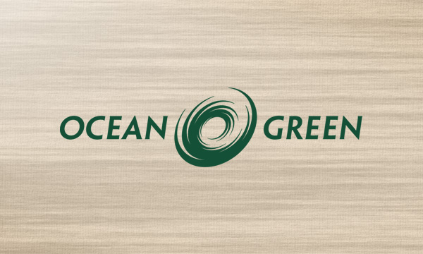
Here's a simulated decal on a balsa and hemp board...
Is the design any good at all? Any feedback would be great. I feel a real responsibility for this one.