
hi,
I am working in a Slab serif font. I would like to have some critics.
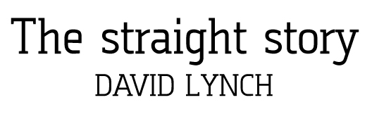
here's a pdf file
thanks
| Attachment | Size |
|---|---|
| novaFont.pdf | 32.32 KB |
hi,
I am working in a Slab serif font. I would like to have some critics.
here's a pdf file
thanks
| Attachment | Size |
|---|---|
| novaFont.pdf | 32.32 KB |

Quite nice, I think that the serifs are somehow weak in the figures, the ‘N’ is a tad too wide, and that you should connect the tail of the ‘Q’ ; besides the rules for the ‘€’, its bars shouldn`t be so loose.
I think your right,
thank you for your help.
I am going to work on it.
Captured from commoncrawl.org on 26 Apr 2015. original URL