
I'm trying to recreate a logo, but cannot ID this font. Can anyone help me out? I would appreciate it.
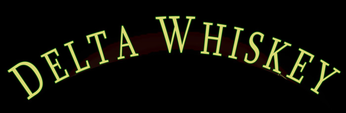
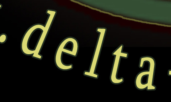
I'm trying to recreate a logo, but cannot ID this font. Can anyone help me out? I would appreciate it.
Whatever it is, it's squooshed.
Yeah, your right. Too bad my collection has nothing by the name of squooshed.

Judging from the details of the lower case, if this is a custom font, somebody professional did it. However, I can't find any slab serif to match the combination of the 'a', 'E', "K", and 'W', which are all key letters I use for my Serif Font ID Guide. I've searched both the new and old Big Yellow FontBooks, to no avail either.
- Mike Yanega

Whatever it is, it’s Dutch. Cannot place it right now, but it may come to me (it is 5:40 am here).
Good to know I'm not the only one who's stumped.
Using Erik's comment I hunted through the samples in 'Dutch Type' by Jan Middendorp. Unfortunately, typeface samples in that otherwise great book are of widely varying usefulness and completeness. The only typeface I saw that I thought had something of the look of the sample was Just van Rossum's 'Gak Serif', which was a custom job for GAK, the Dutch government insurance agency. However, the sample has too few letters to see more than the similarity in the serifs for the lower case. I couldn't find any samples of it online either. Gak serif is wider than the Delta Whiskey lettering, but we know how easily width can be adjusted. I'm not saying Gak Serif is the answer, but possibly it is a van Rossum design ('shared DNA' rationale used in the Gulliver thread). It seems unlikely to me that Delta Whiskey would have custom type designed for them, so I really doubt my own answer, but wanted to say what I found from searching that book of Dutch Type. One thing that was apparent was there seem to be relatively few Dutch slab serif designs.
- Mike Yanega

Man, this is a tough one. K doesn't match though.
Tim ,that was a good try, but the lower case, especially the 't', is different and the serifs on the Azuza caps are not as slab-ish.
I wonder if Erik has any more ideas about the Dutch designer? This one really has me intrigued now.
- Mike Yanega
I decided to see if someone would answer this question through the Band's website contact point, and I wrote to them with our question. (I didn't even know it was a band before looking it up.)
- Mike Yanega

Sylfaen.
hhp
?
Hrant, The only samples I have found of this show non-Latin characters. You're saying these are the Latin letters from this font?
- Mike Yanega
He's absolutely right! I just downloaded the font and opened it in Fontographer. That's what this is -- the Latin letters from a multilingual font that includes Armenian, Latin and other letterforms. I will make a sample and post it shortly.
Score one for Hrant.
- Mike Yanega
Whatever it is, it’s squooshed.
You were right about that Stephen. Here is a sample of the Sylfaen Latin letters with the lower sample 'squooshed' to 75% width. This font was from Microsoft, but I thought I also saw one attributed to Tiro Typeworks.
- Mike Yanega


From the copyright info:
Sylfaen was designed for Microsoft in 1998 by John Hudson and W. Ross Mills of Tiro Typeworks, and Geraldine Wade of Monotype Typography. Sylfaen is a Welsh word meaning "foundation"; an apt name since the font stemmed from research into the typographic requirements of many different scripts and languages.
This version of Sylfaen supports the WGL4.0 character set, for Pan-European language coverage. In addition to Latin, Greek and Cyrillic letterforms, the font contains the characters necessary for support of the Armenian and Georgian languages.
Thanks for the information Paul. This one's going into the Serif Font ID Guide.
I still can't quite get over someone recognizing this, but I guess if anyone would, it would be Hrant. Way to go!
- Mike Yanega

We've been friggin' schooled by the Armenian mountain lion. How did he do that?!?
I see in the new FontBook that Mr. Papazian is the digitizer of another Armenian font called 'Maral', so he must have been checking out the competition ;)
- Mike Yanega
No way Yves, I cannot run with you font ID hounds - I know because I once tried and quickly ran out of breath. I just hunt in my neck of the mountains (and I once composed a moderately detailed review of Sylfaen for MS).
hhp
Still an impressive ID, compadre. ;^)
Yeah, Hrant you are a geek whether you want to run with us or not. ;^)
You might be interested to know that the web page designer, Matt Browne, wrote back and confirmed that he used Sylfaen (just before he saw that we had already solved it, thanks to Hrant).
I think this is noteworthy in that I have rarely had much luck getting replies from anyone when writing to a site about fonts. Kudos to Matt for being willing to help some font fanatics.
I have asked him how he happened to use this font, and I'll let you know if I hear more.
[edit: Turns out the designer of the logo (Matt Browne) is also the lead guitar in the band "Delta Whiskey'. My apologies to Matt for not recognizing that you were wearing two hats.]
- Mike Yanega
Yes, it's a rare treat getting a direct font-ID reply.
Rock on, Matt! (As if I could ever fake being hip...)
> I have asked him how he happened to use this font
Braced for a pedestrian answer (which is how most people
choose fonts) I'd nonetheless be interested in this as well.
hhp
> Turns out the designer of the logo (Matt Browne) is also the lead guitar in the band 'Delta Whiskey’.
Happens more often than you'd think. ;^)
Then again, you have to be a creative person to be able to design a logo that's worth its salt. And to be a decent musician. It all adds up.
"you have to be a creative person to be able to design a logo that’s worth its salt. And to be a decent musician. It all adds up."
Quite so, and I do know you speak from experience ;)
Matt did write back, and said "I'm not sure why I decided on that particular font. I was going for a bit of vintage vibe, liquor bottle style, and just happend across it. After shortening the height [he is referring to the 'squooshing'] it got where I wanted it and it stuck!"
- Mike Yanega
Captured from commoncrawl.org on 28 Apr 2015. original URL
