Typophile

ADOBE, WHAT HAPPENED? OTs released without OSFs

mondoB

If you are interested in buying Font Folio, Adobe's complete OpenType library on CD, reading the on-site sales copy might lead you to conclude that, aside from higher tech quality, a new order of glyph options, especially easy access to oldstyle figures, is promised *across the board* in this expensive product. But customers found out otherwise--the hard way. Many fonts/families did indeed sport complete new glyphs and oldstyle figures, but others had only limited glyphs without oldstyle figures, and quite a few offered only the Euro symbol as the new element.

Let's have a moment of silence for glyphs missing in: Mendoza, Giovanni, Galliard, Bell, Berkeley Oldstyle, Esprit, Ehrhardt, Goudy Modern, Guardi, Hadriano, Horley Oldstyle, Italian Oldstyle, Legacy Serif, Minister, Photina, Plantin, Raleigh, Stone Serif, Veljovic, Versailles, Wilke. That's just serif text families; I didn't count the sans text families.

Whatever the reasons, surely it is in Adobe's interest to qualify their sales copy for this product so customers can buy with their eyes open. Because it's difficult to research glyph schedules for over 2,200 fonts, can you specify, in one place, which fonts/families have complete glyphs, which have limited glyphs, and which have only the Euro symbol?

Aren't all those licensed typefaces? In that case your rant should be adressed at Linotype and Monotype and ITC (all under one hood now, as it is).

As far as I know all Adobe Originals OTFs have extensive glyph-sets.

Mondo mate have you ever even attempted to make a bloody typefacw? I doubt it. It is a bproblem when you get big players like adobe cos all they ever seem to do is suck the whiner s out of the woodowork like maggots. When you spit the dummy about stupid shit like this then you make me spit the dummy!!!

Muzz

As I've heard they have only just started planting the trees for the oldstyle figures to grow on.

"...your rant should be addressed at Linotype and Monotype and ITC."

Monotype and ITC are actually stepping in to fulfill OpenType's potential by converting their type one faces to OT with complete glyph sets. They're part of the solution.

[Edit]

I'm pretty sure the presence of osfs has to do with what Adobe had licences for.

Many Adobe fonts do have all the goodies, including some Monotype fonts like Bulmer, Dante and Fournier. It seems if Adobe had the osfs available in their library, they were added.

I note that Adobes' EULA is more liberal than many, and it may be that it was difficult to come to an agreement with the other foundries.

I like Adobe, but I have to admit...not including OSF in an OpenType font package is a pretty wicked surprise.

I think that it is easy to overlook the real, basic beniefits of OpenType fonts. For large foundries, the best thing OT fonts have going for them is their cross-platform compatability. Instead of having the worry about 20,000 fonts, because you have every font in Mac and PC versions, or even worse 40,000 fonts, because you have Mac PS, Mac TT, PC PS, and PC TT, you just have 10,000 OT fonts. And these 10,00 work everywhere (that supports OT…)

Aside from this, OpenType can include lots of other benefits, like typographic features or support for more languages. But a font is still a "real" OpenType font, even if it has neither of them.

There are really already two generations of OT-fonts at most larger foundries. The first generation was just a conversion… cut down on cross-platform issues. The second generation is where the features and the languages came in. Many smaller foundries didn't even come to the OT table until generation 2. Generation 2 fonts are better, without a doubt, but they take time to make. They'll be there, don't worry. Even if all of them aren't there yet.

OpenType is a technical standard; it doesn't specify what characters must be present. It's something of a marketing issue: you can't tell by the name 'OpenType' whether the font will have 256 characters or 3400. "Pro" is usually a good indicator there's more included, but foundries should provide showings of the specific character set of a particular design. Otherwise there's no guarantee of small caps or anything else. Producing OpenType Pro (or other advanced, enhanced OT fonts) is much more labor-intensive than simply converting the format of an existing PS or TT font. Check the character set before you buy, and look for a specific designation like "Pro".

The licensed (non-Adobe) OpenType fonts in the Adobe Type Library are all produced from the Type 1 versions which preceded them. If you look at a pre-OpenType catalog of the ATL, you'll see that whatever was or wasn't present there is the same for the OpenType versions. Of course we took all the supplemental fonts we had and combined them into a single OTF and made the alternates accessible through layout features as best we could. It was, essentially, a conversion project.

So yes, the OpenType versions of these fonts were not expanded, but neither were they reduced or limited. Licensing issues aside, I assure you we had our hands full expanding the Adobe Originals.

As for why the various expert glyphs (oldstyle figures, smallcaps) weren't available in the first place, that is probably a licensing issue in most cases, and such things are not trivial. That's some history I don't know much about, but maybe Thomas or someone else might have more to say about it.

Thanks for being so obnoxious. We really don't get much of that on the Internet and it is just so refreshing and enjoyable.

"Thanks for being so obnoxious. We really don’t get much of that on the Internet and it is just so refreshing and enjoyable."

LOL!!! :-)

ChrisL

Eheh, it's interesting to see how Adobe has helped raised the typographic bar so much, that now people take all the typographic niceties* for granted in every font :^)

* Small Caps, superiors, inferiors, ligatures, oldstyle figures, alternates, and the list goes on...

The complaint here is valid; let's talk remedies.

John,

Refuge from what? Could it be your thread title? Chris has shared useful information, as have others. If you have a product request, frame it as such. If you want to influence Adobe's actions, I would try a different tone.

"If you have a product request, frame it as such."

See above.

It's far more complicated that simply "retrieving" old style figures. The font data you're talking about are owned by someone else, and are not presently (and have never been) part of any licensing agreement with Adobe. It is far from trivial to negotiate such things. Sometime it is not possible. Remember, Adobe and Monotype have their respective businesses to run, and there are perfectly legitimate business reasons why you might never see this material in a font sold by Adobe. I don't know where you got the idea that the supplements for Plantin, et al., are so easily available to Adobe. That's simply not true.

It is even more fantastic to suggest Adobe commission such additions. We are not at liberty to create and sell additions to a typeface we're licensing from another foundry any more than, say, Monotype is at liberty to commission and sell additions for Minion.

I read Chris' post with interest, but it did not seem to answer anything or exhibit much concern. Perhaps that's why we rant.

Amazing. You post a simplistic, insulting message and complain about the quality of the response you get.

"Amazing"

No, the word is "Trolltastic" :-)

What I find amazing is the restraint by Christopher in his replies. He remained a gentleman and proceded to be helpful even though the opening volley question from MondoB (and all his others) were insulting and untrue. Christopher should be applauded.

ChrisL

"You...complain about the quality of the response you get."

Of course I do. Aside from gains in tech quality, one of the key selling points for buying OpenType is that the user's favorite glyphs, which in type one format were placed in expert fonts, will now be accessed more easily if the customer re-buys their favorites in this new format. And then, by my count, 21 serif families fail to deliver that key glyph option, and the user is left in the dark as to why. Monotype Bembo and Dante get full glyph coverage by Adobe in OT, while Bell, Photina, Plantin and others do not. Same company; what's the problem? These are not small discrepancies, but a glaring industrial problem, and I want typophiles to be aware of it in its true scale. With 435 reads the first day, this rant post serves that useful function.

Bringing about completions through collaboration is not a fantasy but rather a business opportunity not to be scoffed at. Take, for instance, Guardi, designed by Reinhard Haus of Linotype in 1986 before oldstyle figures became as prominent as they are now. This stylish Venetian face would get a completely new lease on life, in coordinated OT release, by being completed with OSFs and other glyphs in partnership with the licensor. Would the original designer and Linotype simply say no to that? We would love some answers, but more important, we would love creative, collaborative action to bring full glyphs to every text family where it is possible, particularly when each remedy means a fresh opportunity to sell. You feel insulted...what about the Adobe customers who still want to roll out Plantin with loaded OSFs?

and the user is left in the dark about it.

i don't think this is true. i believe adobe and many reseller sites enumerate which features are available in which fonts. it take doing your homework to see if the options you want are available, but i think this is going to be inevitable with new OpenType Pro fonts: you have to check the list of ingredients.
now on another note. John, i think we've all gotten your memo about the importance of OSFs. can you stop harping on it for a while? it's kind of like listening to a one-note piano concerto.

Thanks John Nolan...exactly what I mean...those who bought the Adobe OT library thinking they would get Plantin with OSFs discovered they have now to RE-BUY elsewhere to get the complete glyph coverage they thought Adobe would offer as a matter of course. Older example: Stone Serif, released thru both Adobe and ITC in the early 90s...ITC offered OSFs for it years ago, but when Adobe converted Stone Serif to OT, OSFs were still missing. Why?

The status quo is hardly in Adobe's interest. Competitors are now plugging the gaps in their library for them. Why buy Adobe's incomplete Plantin (or others) when Monotype or ITC offer complete versions?

Why buy Adobe’s incomplete Plantin

Adobe's Plantin?
I think Mr Slye made it clear that Adobe's library consists of different typefaces from different sources. Adobe is originator of some, but kind of distributor of others.* (I hope this is plain enough yet still not too far from the truth.)
When complaining about "Adobe's" "incomplete" OT fonts, please remember that other foundries/resellers, including LT, MT and ITC, came out with their first OT fonts very late; MT and ITC were the last ones if I remember correctly. So there's a certain irony to it if you put all blame on Adobe ...

Indeed it is wise to compare different versions before licensing a particular one, or to find out which foundry is the originator of a typeface because they may offer the most complete family or latest version or whatever else. At least this is what I do.

@ John Stahle (a.k.a. mondoB)

How many times it needs to be said that ADOBE DOES _NOT_ HAVE THE LICENSE/AUTHORIZATION TO INCLUDE ANY ADDITIONAL GLYPHS IN THE FONTS YOU'VE MENTIONED.

We know that, Miguel...instead of waiting for licensors to update their faces at their own pace, Adobe could collaborate to complete glyphs on a typeface, then market the result jointly, exactly as two opera houses might co-produce an opera. So if Guardi, languishing with only lining figures, becomes Guardi Pro with OSFs and other glyphs, it might attract new well-merited attention it never got before.

We're also raising the far more intriguing possibility of concerted action, across the industry, whereby every font released in OT by anybody has uniformly complete glyph coverage as a new industrial standard of benefit to everyone. That way, stubborn holdouts like Monotype's Horley Oldstyle might find new popularity when given complete glyphs, esp the OSFs implied in the name.

But in the meantime, smart shoppers, as KL mentions, can find what they want elsewhere--Monotype's complete OT version of Plantin is sold on their site right alongside Adobe's incomplete version, which of course is also acquired from Monotype. And yes, they distinguish each by its "source" exactly that way: in their view, it IS "Adobe's Plantin."

Well, we've had a lovely visit to the Adobe suggestion box...my sincere thanks to Typophile for letting me air my heretical views in some detail...everybody, enjoy your holiday bird--served with oldstyle figures!!

T Bones: Sorry to dissapoint you mate, but is a photo of old Chopper Reid, an Aussie hero! I find him bloody funny, but nothing to do with typefaces!!

Do you feel better now Mondo? Had a good rant and got it all out of your system?? Maybe you could just take it easy and have a beer or two with your mates. it might be better to "put things in perspective" as me dear old mum would say. You're acting like its a scandal or something.

Muzz

John, I think part of the problem is although I think your complaint is valid— how you choose to convey your points are often a bit extreme. Instead of accusations, perhaps inquire about why this exists, instead of going on a tirade. Shock tactics often work to get attention, but once you've gotten the attention the tactics can be called into question.

On the other hand, while it is the buyer's responsibility, to investigate the features in large font packages...what is included with each family can also be misleading. In addition to going through a line item on every font in a package (which can number in thousands) the user is also expected to check every feature associated with every single font in a package? Let's get real people, spending thousands of dollars on a font package and finding a surprise like this might get you a little miffed. No disrespect to the people who worked hard on putting packages like this together— but we can't forget about the consumer, this can be considered misleading.

Of course I wish we had all those extra goodies in the OpenType versions of the third-party licensed typefaces in our library. And I can understand some folks' frustration at the face that those goodies existed (if not ever in Adobe's type library) but were not included in Adobe's OpenType versions of the fonts.

It might help people to rewind the clock to round about late 2001, when Adobe was doing planning to convert its entire library to OpenType.

It was clear to us then that the rest of the type industry needed a indication of commitment from Adobe, that this OpenType thing was more than just a flirtation. Converting our entire type library to OpenType seemed like the strongest measure of that (along with increased OpenType support in our applications, which we were also working on at that time).

My take is that negotiating new contracts with Linotype and Monotype/ITC, and then integrating additional materials, would have delayed things a couple of years if it was even successful.

I can't know for sure, but I wouldn't want to bet either way on whether Lino and Mono would have agreed at the time. Heck, Linotype hasn't even given Adobe the rights to resell any of the fancy new OpenType fonts they've made over the last few years. Clearly they feel there is value in keeping some goodies to themselves.

But even if it had been a viable option, delaying our OpenType conversion for, say, two years to incorporate more goodies would not have been a wise move, IMO. In those first few years of OpenType it was not a foregone conclusion that OpenType would become the new standard and other type foundries would flock to it. Had we taken too long to get our library converted, it would have raised serious questions about commitment to the format, and quite possibly cost us the momentum we needed - I'm not sure we would have reached "escape velocity" with that delay.

At *best*, I believe it would have slowed the rest of the industry's conversion to OpenType by about two years as well. I can imagine us being in this alternate universe, wherein QuarkXPress 7 doesn't have any OpenType layout support, and the rest of the type foundries would be now at the point they were at two years ago - and that's my *best* outcome.

If we'd had to tell Adobe's own applications that we wouldn't have a converted font library until 2005, I don't know if we'd have gotten their full buy-in when we did, either. Being able to promise that the fonts were coming and quickly was an important part of why our own applications bought into the feature support. So at worst, OpenType might have been relegated to the same status as AAT or multiple masters... ack.

That's all speculation, of course. That being said, I've watched this very carefully from the inside for 9.5 years now, and have been involved in a lot of discussions about OpenType support with our own applications, third parties, and OS vendors over the years.

So, I wish that we had more typographic goodies in the third party fonts, but even if we could revisit that decision, I don't know that I for one would be arguing for us to so it differently.

Cheers,

T

Thomas Phinney
Product Manager
Fonts & Global Typography
Adobe Systems

Oh, and as a side note, one can accuse people of whatever you like, but calling the type group at Adobe lazy is just plain hogwash. You have no idea how hard this team works, and how many hours a week they put in.

I was down in San Jose Monday through Wednesday last week. I vividly remember sticking my head out of my borrowed office at about 6:30 or 7 one evening as I started to think about dinnertime. The majority of the entire group was still in their offices, cranking away.

And this is nothing compared to the hours people were putting in during the library conversion....

Cheers,

T

Mondo,

I think you should understand a simple thing: it was not a matter of Adobe "collaborating" with Linotype, Monotype or ITC. My guess is that when Adobe released the "Std" versions of the Linotype, Monotype and ITC fonts, the LinoMonoITC conglomerate (as it is now) were interested in releasing "Pro" versions of these faces later. So it was quite obvious that neither Linotype nor Monotype/ITC were particularly fond of giving the data to Adobe on a "good will" basis. Also, adding new glyphs requires new kerning etc. With the sheer number of typefaces in the Adobe Type Library, this would surely delay the production considerably.

But there is a simple key to the naming in the Adobe Type Library. "Std" and "Pro". You can simply assume that the Adobe "Std" fonts are simply a sum of the previously existing Adobe Type 1 fonts while the "Pro" fonts have been reworked and expanded.

The Plantin Type 1 versions with OsF you're referring to were the Monotype versions, not the Adobe versions, as far as I can tell.

A.

Figuring out what is available in a type family isn't that difficult. Yes, some sites do not offer enough information. However, if you know what it is that you need, why is it so difficult to find out. Most foundries can be reached by phone or e-mail, or even here on Typophile.

If you took the time to look on the pages at Adobe you'd notice they tell you right there on the page what you are getting with the font. A little comparison can go a long way.

Exhibit A: Plantin STD

Exhibit B: Garamond Premier Pro

I wonder if mondo will have the balls to say sorry.

Muzz

Mostly I wonder who the rest of "we" is?

ChrisL

Figuring out what is available in a type family isn’t that difficult. Yes, some sites do not offer enough information. However, if you know what it is that you need, why is it so difficult to find out.

Tiff, I think it is often more difficult than it needs to be. While your example is an "ideal" situation, if you're starting from scratch building a type library from the ground up and you need for example ALL of the classics— line item searching takes a long time. Time you may not have when you've got a lot of clients and a lot of work piling up.

Example. I did some research to get the most cost effective package(s) to get the company I work for up and running. I found a few fonts in the package were bits and pieces of complete families. Huh? What am I going to do with just the bold weights of some well known families? A consumer can feel like (at least I do) that if I can't have it all there...don't give it to me at all.

It's like buying a bicycle and finding out there's no wheels in the box. I'm not saying I'm not partially at fault— but buying font bundles can get a little tricky.

I guess I am idealizing, I'm sorry for that Terry. Yes, this example I've posted above is probably a best case scenario.

Perhaps this is the downside of buying (in) bundles. That being you might miss something that you would have caught had you only been licensing a single family.

I suppose my reaction comes from my own experiences. That's not to say I haven't had my own fiasco. I've licensed a large family after realizing (remembering) that it was bundled with the software. (Long store, don't ask.)

But I think, perhaps, that when you are buying in bundles it is enough of an investment that someone should be involving the foundry more. Telling them exactly what your needs/hopes are. It sounds like your situation was rushed, that is unforunate.

Muzz,

I wouldn't go so far as to call the 'ol chop chop an aussie hero...

--N

Many thanks to Thomas for an illuminating post. Launching OpenType was a
high-wire act, for which Adobe deserves all kinds of credit. But we also see
this work is far from finished. The initiative for transforming type
classics into full-glyph OpenType has passed to others, notably Monotype and
ITC. That's where the OT action is now: the new issues at fonts.com and
itcfonts.com.

I voiced my complaint on behalf of the many customers who spent thousands on
Adobe's complete OpenType library expecting to enjoy a new world of options
across the board. Then, in a dismaying number of faces, they got nothing of
the sort. For quite a few, literally the only new thing was the Euro
symbol. Those who still wanted full-glyph versions of faces left incomplete by Adobe now had to BUY THEM AGAIN elsewhere, if they could. For these burned customers, my complaint would seem understated.

Mondo,

I'm not sure why it is so that you or other customers believed that the new OpenType library contains something that it doesn't contain. I remember Adobe advertising the OpenType library as offering a cross-platform font solution (the same font file for different operating systems), easier access to various extra glyphs such as ligatures, Unicode compatibility, the presence of the euro character, and -- for the "Pro" fonts -- expanded character sets. This actually already accounts for a "new world of options".

However, if some computer magazine journalist or whoever else this might be made you or some other customers that "everything is new" in the Adobe OpenType library, I'd seriously go and complain to that very journalist or the other person.

Otherwise, I would be interested to hear how you arrived at that very "expectation" that you describe. I don't recollect hearing anybody at Adobe lying about the contents of the Std fonts -- therefore I'd be curious to know.

Best,
Adam

Adam, if you go to their website sales copy for Adobe Font Folio OpenType edition, under Key Benefits of buying the CD, it promises:

--Revive fine typography with expanded glyph sets containing swashes, small caps, and old-style figures...

--Take advantage of multiple font packages with merged character sets, allowing easy access to expert set characters — such as small capitals and old-style figures — when using OpenType savvy applications...

Nowhere on that page does it say "except for families we could not complete this way" or words to that effect. The customer finds that out the hard way. Basically Adobe's response to this complaint comes down to "you should have read the fine print" or rather checked out each font or family's glyph schedule. But as Terry Biddle said above, this is completely impractical--there are "more than 2,200 fonts."

If you read the Key Benefits, you will see that a customer would be easily misled into thinking full glyphs are promised across the board. I've heard exactly this lament from plenty of NYC type buyers who are usually tough customers. The helpful thing would be for Adobe to list faces/families by their glyph coverage in one place; nothing of the sort appears in the sales section now. Thomas, in his post above, admits the validity of our complaint while pleading extenuating circumstances. For those burned, that's very cold comfort, and for the retailer, worse PR.

John, I sympathize -- up to a point.
I think your expectations have been fluffed by Adobe's largesse, which has also made them somewhat indiscriminate.
So it's good that you have raised this issue, so that reality can set in.
The fact is, as the foot soldiers are pointing out, OpenType is a huge job of work.
With the bernefits it offers also comes the responsibility, and the onus, for end users to become more informed about the differences between font features -- better typographers, even. Because there is no longer a standard font format, if there ever was. Even with Adobe's offerings, which do a good job of being consistent, there are still internal discrepencies, such as the Adobe Caslon Pro Small Caps issue (when you select small caps in InDesign, you get vrai for the Roman, but faux for the Italic). I mention this not to castigate Adobe, but to draw a line that is hopefully helpful.

Now mix into the equation the different feature sets that independent foundries will implement in their OpenType fonts, and I think what will emerge is a cultural environment where the expertise of typographers will come to the fore, in discriminating between not just the aesthetic quality of typefaces and fonts, but also their functional capabilites, based on their differing feature sets. So mass bundling won't be an easy option, for seller or buyer.

Thanks Nick...you second a point I made, that we type lovers have to become very tough type shoppers. As I mentioned, the OT initiative has passed to other sources, like Monotype and ITC. From ITC, at long last, we can now get Berkeley Oldstyle with the oldstyle figures they had originally, pre-Postscript. And who ever thought we would see oldstyle figures for ITC Franklin Gothic? These options have emerged only in the past year. And, after the period of exclusivity I presume the licensors want, Adobe could acquire these completed versions in place of the incomplete versions they sell now.

Mondo,

if I were to buy a library of 2,200 fonts, I'd seriously ask myself "did they actually extend all of those 2,200 fonts with additional glyphs"? Now, I agree, this skepticism would mean that the potential buyer knew the original Type 1 offerings of Adobe (which often were without OsF). But I don't see how a reasonable buyer should be disappointed by finding out that the 2,200 fonts he got are not "all noo" ("noo" being a New York pronunciation of "new", btw ;)

This really almost boils down to the popular belief that fonts grow on trees. The fact is that now, due to OpenType, companies such as Linotype, Monotype, ITC start extending their fonts with additional glyphs -- but this is done *one family at a time*. Anybody who even remotely understands type design would realize that the Adobe OpenType library could not realistically be extended in their entirety.

I simply cannot agree that it is fair to call Adobe "lazy".

Fortunately enough, the naming key ("Std" vs. "Pro") should be a good indication on what is going on.

"the naming key ('Std' vs. 'Pro') should be a good indication on what is going on."

except it isn't. "Std" means a lot of things, discoverable only by researching each font's glyph schedule. Monotype Dante and Bembo "Std" have been converted impeccably, with full glyph coverage and beautiful, easily accessed oldstyle figures, but Monotype Photina Std contains no new glyphs at all, just the Euro symbol.

Monotype Photina Std contains no new glyphs at all, just the euro symbol, even though the type one version had expert fonts with glyphs.

Adobe did not sell any Type 1 expert fonts for Photina. Adobe converted its library from Type 1 to OpenType, and it's safe to say that if it's a non-Adobe font, the OpenType-format font has the same glyphs as the Type 1 font(s) (aside from some marginal additions like Euro). I know of no cases where anything was removed.

At Adobe, the name "Pro" means that the character set supports Central European languages. Anything else is "Std". Other font vendors have chosen to use those suffixes and assign different meanings -- but Adobe was the first to use them as far as I know.

Whether Adobe was lazy or just impatient, sweeping the incomplete into the same bundle with the complete, we don’t know and they’re not saying ...

The concept could not have been more simple: convert our Type 1 font library into OpenType format. I think Thomas's description of the process and decisions and reasoning was detailed and accurate. (Thanks, Thomas!)

Thanks Chris...I meant to cite Plantin as carrying expert fonts in type one; Photina, as you say, did not. According to the Precision Type Font Reference Guide Version 5.0 (1995), p. 305, Monotype Plantin 1 and 2 expert sets were offered by Adobe in type one, which makes their absence in Adobe's OT quite puzzling.

Hmm, I see that. It looks like Precision Type's choice of format is misleading there, since they have their foundry codes next to the family name and don't seem to have a way to specify the extent of each particular foundry's offering. Despite what the PT guide (unfortunately) implies, Adobe never had the Type 1 Plantin expert fonts in its library.

I just dug up my old type one Plantin Expert fonts, and under the screen fonts suitcase file "more info" in OSX it says they carry a 1991 copyright from Adobe. So I must have acquired them from Adobe. But thank you for checking at your end. Maybe Adobe somehow lost the rights to the expert sets after the mid-90s and before OT conversions, because in your Adobe type library reference book dated Oct. 2000, they don't appear under Plantin, although other Monotypes still had their expert sets. A puzzle.

That's really weird. I have the Adobe 1991 type catalog here and there are no expert Plantin fonts listed there. (The 1990 Adobe catalog doesn't list any Plantin, so Adobe must have been added just after.)

I'll ask around the office.

...and a "creation" date of June 1992, presumably followed by release. These are the Adobe-copyrighted Plantin expert fonts I've been using ever since. I tried to upload a screen snap of the file data, but it wouldn't take.

Thanks to whoever renamed the thread to a less offensive title.

Ah, David Lemon was good enough to explain it to us. Monotype licensed Adobe's Type 1 font production tools to produce their own Type 1 versions of their fonts around 1991, and that resulted in Adobe copyrights in the font files.

Most of those same fonts were later licensed to Adobe and rebuilt by Adobe to our technical standards, but Plantin Expert was not among them. I can't say why.

But the rule of thumb is still simple: we converted everything that we had the rights to convert from Type 1 to OpenType, merging all supplemental fonts that were available to us at the time. We continue to sell the Type 1 versions, although they're a little harder to find on our Web site. So you can tell we didn't have Plantin Expert by seeing that we don't have it now. Go to the appropriate page for Plantin Std and click on the "More Info" tab at lower right, and you can find the Type 1 fonts listed.

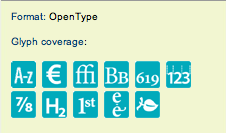
Of course, if you want to know what's in the OpenType font, all you have to do is look at the cyan blue icons right on the main page for each font or family. Or you can download the PDF that shows every glyph in the font. It's not like we make it hard.

Cheers,

T

Thanks Thomas for digging up what happened with Plantin. I revised the thread, not wishing to offend. We are still interested in what can be done in two areas, and would love your comments on:

--can Adobe qualify their sales copy for the complete OT library Font Folio so customers have a clearer sense of what is and what isn't there in the way of glyph coverage? Specfically, can you summarize hundreds of glyph schedules in one place by listing which fonts/families offer complete glyphs, especially oldstyle figures; which offer limited glyphs; and which offer only the new Euro symbol? Helpful for buyers, good PR for Adobe, I should think.

--longer term, what can be done by Adobe to acquire complete-glyph OT versions as they appear from licensors like Monotype or ITC? I presume they want a period of exclusivity, yet it is still a cherished wish of many here that Adobe's incomplete versions would in time all be replaced by completed versions, so that your OT library eventually can offer uniformly complete glyphs across the board.

Mondo,

"uniformly complete glyphs across the board" is wishful thinking. Does having oldstyle numerals qualify as "complete"? Small caps? Central European diacritics? Case-sensitive forms? Ligatures? Basic Cyrillic? Extended (Central Asian) Cyrillic? Basic Greek? Polytonic Greek? Cyrillic and Greek smallcaps?

What exactly is "uniformly complete"? For whom? For customers from USA? Canada? Brazil? Germany? France? Wales? Estonia? Poland? Greece? Turkey? Romania? Russia? Serbia and Montenegro? Kazakhstan?

How complete is *your* "uniformly complete"?

Regards,
A.

The architects of OpenType made the OpenType format inherently non-standard, by trying to cram as much as possible into a single font.

In particular, by mixing language features (encoding) with typographic features ("expert" sets). Expert features are inherently non-standard, whereas it is certainly possible to standardize language encodings.

Perhaps the situation would be more "standard" if there were FOUR flavours of OpenType:

1. Basic Language encoding -Std
2. Basic Language encoding with Expert features - Pro
3. Multiple language encodings - Multi-std
4. Multiple language encodings with Expert features - Super Pro

From a needs perspective, and from a cost-of-production perspective, this makes more sense -- for specialist foundries, and for users.

I'd suggest that #4 would then be "Multi-Pro" in this system.

However, saying "Multi-Std" and "Multi-Pro" equals "multiple language encodings" really tells any given user nothing useful. They don't know whether their particular language needs are met. At least with Adobe's system there is a guarantee, that "Pro" fonts have support for a defined central European character set, as well as the usual western one.

I'll be the first to say that using "Pro" to designate language support rather than typographic goodies wasn't the best choice Adobe ever made. But with many hundreds of fonts out there, we are rather stuck with it. Other folks can do what they like, of course, though one rather thinks some consistent naming schemes would be good.

Cheers,

T

T

Thomas,

I'd say the choice was good. The Adobe naming suggests that fonts without characters supporting *all* of EU's Latin-script language are less valuable than those that include all of them -- regardless of the fact how many small caps or ligatures they try to offer in exchange.

Language coverage is like good nutrition and healthy style of living. Swashes and small caps are like make-up and nail polish.

I have another naming scheme to offer: the fonts with just the Western character set are "Minimal", the ones with EU-wide Latin-script support are "Standard", and those that include all of Standard but offer something beyond that (small caps, swashes, Cyrillic, Greek) would be "Pro".

Using these terms, all of Adobe's Std fonts would be "Min", Linotype's "Helvetica Neue Pro" would actually be "Std", while I think all of Adobe's "Pro" fonts would keep the "Pro" label.

I wish at some point, Adobe would at least leverage their "Min" character set support to my "Std" (or even better, "Pro").

Please start with Utopia and Kepler, then Poetica :D

Regards,
Adam

twardoch, "complete" will always be a relative term. Since my usage stops at the Cyrillic border, I can't help you with many of these issues; Adobe meets my language needs now. I am concerned, however, to help the western-language designer conveniently get a clear idea of what he's buying with his thousands. Our needs center on style options, which for us are anything but frivolous. Maybe we just want oldstyle figures for our Meridien, and can't get them.

Language coverage is like good nutrition and healthy style of living. Swashes and small caps are like make-up and nail polish.

Yes to the first part.
But Swashes and small caps are the seasoning that make nourishment a pleasure.

mondo,

my point exactly. Your "complete" is not my "complete". Therefore, it's pretty obvious that your hope for Adobe or some other foundry to offer "uniformly complete glyphs across the board" cannot be fulfilled, since there always will be natural differences: there will be a small number of fonts with a large, extensive character set, and a large number of fonts with a moderate or small character set.

We'll also differ in priorities: if Adobe ever has the capacities to extend the character sets of some of their fonts, your plea will be for old-style figures and mine will be for Central European characters. You could make a point that fonts without old-style figures are no better than Arial or Times New Roman, while I could make a point that fonts without CE characters are simply not usable at all in 40% of the European countries. Either way Adobe choses, one of us would be unhappy. It's not possible to please everyone.

A.

It’s not possible to please everyone.

But Cyrillic small caps shouldn't be too much trouble :-)
The trick is to make your Cyrillic lower case the same x-height as your Latin small caps. Then, if you keep the Cyrillic small caps the same x-height as the Cyrillic lower case, you only need to make three new glyphs. Still, there's kerning too, to do it right, but as it's an OT font, class kerning makes that easy.

"It’s not possible to please everyone."

they can sure get closer to that goal than they are now! Good place to start: what Adobe promises to OpenType customers in their English-language sales copy on-site--with fewer exceptions. In Adobe's OpenType library now, "Std" may mean a lot in one family, but just the Euro symbol in another. Just fulfilling their sales copy would be a notable step forward.

I recently bought Storm Foundry's Regent II in PS type one, and they show a lot of CE accents in their glyph layout alongside the loaded OSFs...I wonder if their new OpenType version goes even further, to the point of satisfying both of us? An intriguing possibility.

If I get a Czech or Estonian text, I do have options now from Adobe in my system. If some very sophisticated client wants oldstyle figures with Meridien, I don't have options.

Mondo,

the thing is, in Estonia, 99.9% of the text published is in Estonian. That doesn't have anything to do with "client sophistication", it simply limits the options down to 20% of the library or so. In other words, CE support is a *basic* requirement for many markets -- without it, the font is completely useless. Oldstyle figures always will remain a *sophisticated* extra. People will do without them, albeit they will complain. But this will not stop them from using the font on another occasion.

A.

The devil is in all the legacy typefaces and all of the legal entanglements they bring. This is a huge headache for old and very large foundries like Adobe, Linotype/Monotype that have bartered brides and prenuptual agreements with more parties than caterers dream of. Once the big foundries can step out of that quagmire and do new opentype faces from scratch, it becomes easier. All the "new" Adobe original post opentype era faces take language differences and support as well as features like OSF hand in hand. I guess if you can get beyond the lawyers and brokered business deals all is well for the future. Until then, we are in litigation purgatory.

ChrisL

Mondo wrote a while back: "The initiative for transforming type
classics into full-glyph OpenType has passed to others, notably Monotype and ITC. That’s where the OT action is now: the new issues at fonts.com and itcfonts.com."

The first sentence is true, because those foundries (and Linotype) own most of the classic typefaces, and they are the only ones in a position to extend them further.

The second sentence is a matter of opinion, but what Chris wrote just above is very true - if you look at recent Adobe releases such as Garamond Premier and Bickham Script Pro (or our upcoming ones, Arno and Hypatia Sans), we have moved to a model where a typical new Adobe typeface comprises 12-50 fonts with 2500-3500 glyphs per font, language support including CE, Greek, Cyrillic and Vietnamese, and very extensive typographic features. I believe that Adobe continues to set and raise the bar for design and technical quality, language support and typographic features in new type releases.

Cheers,

T

>typical new Adobe typeface comprises 12-50 fonts with 2500-3500 glyphs per font

Holy guacamole! How many folks does it take to produce a font like that?

Well, at a minimum: one to design, one to do production work, and one to test. That's not including the external beta testers.

But the real question is *how long* does it take to produce a typeface like that. To which the answer is, a long time indeed (years, not months, usually). If we were doing more basic families, we'd be pumping out quite a few more typefaces per year.

Cheers,

T

"(or our upcoming ones, Arno and Hypatia Sans)"

Hypatia is nudging its way to the finish line Thomas?

ChrisL

Apart from cross-platform compatibility, what is the advantage of OpenType as far as the END USER is concerned, if the typeface doesn't boast OT's nifty accessibility to an expanded glyph pallette? None that I can see; might as well keep on using the Type 1 version of Photina, for example. Currently, as far as I can tell, one simply can't obtain Photina's oldstyle figures or small caps in any OTF version from any vendor (including Monotype, the font's original publisher). This might be a special case, since Photina's OsF's and SC's were pretty much design afterthoughts. But it sure puts a damper on the upbeat promotional guff coming from the OpenType vendors.

I don't know anything about the character set in Photina but OpenType fonts which have a full feature set have much to offer the end user. The qualifier is that you must be using an application which supports opentype features. Right now, that is pretty much the Adobe Suite CS apps and to some degree the current version of Quark. Most apps will run the font but may not be coded to use all the features in it. What applications are you using and do you have any fullfeatured opentype fonts along the linesa of Adobe Garamond Premier Pro?

ChrisL

"The qualifier is that you must be using an application which supports opentype features."

Any current text editor application within Mac OS X supports the use of ligatures, etc.; how difficult would it be for Microsoft (ironically, one of the developers of OpenType) to implement the advanced typographic features promised by the format? One suspects that, as with the development & distribution of OT font technology, commercial interests have limited the typographic capabilities of Microsoft Word - that particularly bloated white elephant. As for Photina, it has a very limited glyph set, at least by OpenType standards: no international alphabets or expert features. Such limitations are in no way overcome by the use of more sophisticated software applications; even if purchasing the most up-to-date font version, what is needed above all is a program that will support 'legacy' formats, such as PS-Type1 or TrueType (thankfully, neither Adobe nor Apple have yet deemed it profitable to phase out either).

Si can give you a much better take on the Microsoft OTF development story. The only thing I can take from it is that it is far more complicated than it may seem to us on the outside. I think that developing the new font engine for Vista has something to do with it and deciding if it is the operating system or the application that will handle the load.

Si, bail me out here, I am treading on a thin layer of conjecture!

ChrisL

Microsoft has implemented a very complete support for OpenType Layout features in WPF (Windows Presentation Foundation aka Avalon), the new graphic subsystem used by Windows Vista which uses an XML dialect called XAML to formulate user interfaces. Any application using WPF can make full use of OpenType Layout features.

Microsoft Word is far too complex an application to be rewritten completely to use WPF. So currently, it uses GDI as it did for years. But I think soon other applications will apear that will support OpenType Layout through WPF, which is no different than TextEdit supporting OpenType Layout through AAT.

A.

"Microsoft Word is far too complex an application ..."

Yup.

ChrisL

"Microsoft has implemented a very complete support for OpenType Layout features in WPF (Windows Presentation Foundation aka Avalon), the new graphic subsystem used by Windows Vista which uses an XML dialect called XAML to formulate user interfaces. Any application using WPF can make full use of OpenType Layout features."

That doesn't apply, then, to users of Microsoft Word in Mac OS X? Even the new version of Office still in development makes no mention of advanced OTF support. Could there be a commercial reason underlying such a curious absence? Just as, commercial interest underlie the decision to merely convert existing type libraries to OTF, rather than utilise the technology to its much-vaunted capacity?

Admittedly, Adobe's new fonts do make full use of the OT feature set. The more attention Adobe devotes to these new releases, the less it spends on fine-tuning typefaces from an earlier era - Photina, again, being a case in point. Admittedly, my own interest in the font is primarily historical; but then, the same could be said for, say, Adobe Garamond Premier Pro (or thousands of other digital fonts).

ffetish,

this doesn't apply to any Microsoft Office version, Windows or Mac. Microsoft Office for Windows supports OpenType Layout features but only for "complex scripts" (Hebrew, Arabic, Indic etc.) Microsoft Office for Mac does not support any OpenType Layout features at all. WPF and XAML are completely unrelated to Office.

If you're interested in XAML, check out the free beta versions of two Microsoft Expression applications:
http://www.microsoft.com/products/expression/en/Expression-Design/
http://www.microsoft.com/products/expression/en/expression-blend/

They'll allow you to build XAML documents to which you can manually add styling code to enable various OpenType features.

See:
http://www.microsoft.com/typography/links/news.aspx?NID=5759

(Note that unfortunately, neither Expression Design nor Expression Blend allows you to author text using OpenType Layout features directly).

Adam

> Could there be a commercial reason underlying
> such a curious absence?

In a healthy company, most reasons are commercial.

It seems that the benefit of having advanced typographic fireworks in Office application was not so far able to outweigh the cost of inducing uncertainties into such complex applications that need to deal with billions of legacy documents, and where text re-flow due to kerning changes or ligation would cause a lot of trouble.

A.

"...the benefit of having advanced typographic fireworks in Office application was not so far able to outweigh the cost of inducing uncertainties into such complex applications that need to deal with billions of legacy documents, and where text re-flow due to kerning changes or ligation would cause a lot of trouble."

Very diplomatically put Adam :-)

ChrisL

I won't be holding my breath for Microsoft to come to the OpenType party - insofar as advanced typography (as opposed to international alphabet support) is concerned. There are an increasing number of wordprocessing competitors out there that can (1) alphabetically sort my huge list of fonts (for all its bells and whistles, Office 2004 for Mac just gives up!); and (2) automatically implement so-called 'advanced' typographic features, such as common ligatures. The disadvantage would seem to be that in sending .doc or .rtf to another user with Office, such features are automatically removed!

But since this thread was initially about the lack of typographic features being implemented by OT font developers, I might as well resume that thought here. I mentioned already Photina (a font for which small caps and text figures were added as an afterthought). But what about Esprit? To my knowledge, no current OT version of Esprit contains the expert features which are, as Robert Bringhurst suggests, integral to its design. In the case of these fonts, Type 1 (legacy) support is far more important than OpenType support at the application level.

No doubt further examples of certain gaps in the OT font development/conversion/licensing process could be adduced.

Oh, and just for the record - healthy companies don't always make for healthy consumers!

Linotype/Monotype that have bartered brides and prenuptual agreements with more parties than caterers dream of. […] Once the big foundries can step out of that quagmire and do new opentype faces from scratch, it becomes easier. […]
Until then, we are in litigation purgatory.

I like this… :=|

Thanks, Claudio!

ChrisL

Captured from web.archive.org on 4 Feb 2015. view this capture