Typophile

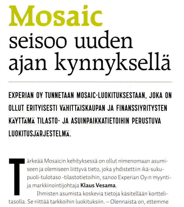
Mosaic magazine typefaces - Raleigh, Auto (still one to identify!)

mili

This is a scan from 121 magazine that just arrived the other day. I don’t remember seeing these fonts before. They are used all through the magazine, sometimes copy text is set in the serif.
The sans has strange Äs, I think, is that very common?

AttachmentSize
mosaic.png201.04 KB

Mosaic and the first two lines is Raleigh.
http://www.myfonts.com/fonts/bitstream/raleigh/raleigh/

Thank you, Pieter! I find the “o”s interesting and unusual.

think the one at the bottom is auto by underware

Good one, James. Two down, one to go.

Well, I took this last one as a challenge, and I think it has defeated me. The counter on the P and R is too big for anything I can find. The J, K, C and S are also hard to find in combination anywhere; and of course the low Ä is really not common at all.

I pretty much hunted the condensed sansserifs at MyFonts, and the best I could come up with were Storm’s ’Ohrada’, Berthold’s ’AG Condensed’ and ’Silverscreen’, from TypeArt.

This is a good mystery, because condensed sans faces are used a lot, but I am coming to the conclusion that this is from an obscure source — maybe a small European foundry.

- Mike Yanega

Thank you for trying, Mike!
That low Ä was the thing that really caught my attention, not too keen on it, to be honest. It looks very strange in words with double-Ä, and that’s not unusual in Finnish, as you can see in this nonsense sentence:

“kääntäisitkö äänilevyn kääntöpuolen ääriasentoon?”

The nex issue of the magazine just arrived with the mystery font used in a headline. Is it any easier to recognise in bigger size?

Captured from web.archive.org on 30 Oct 2008. view this capture