
this was in my drawer for quite a while, so i thought i could show it here to get some feedback. the dashes are placed too high, but otherwhise i dont plan too changes - adding some accents for french and german and $,£,€ for use on flyers.
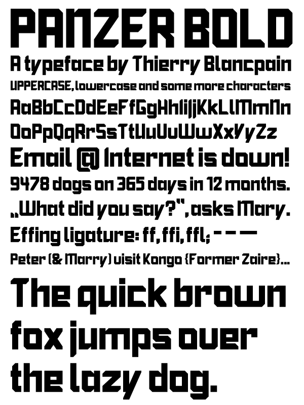
what do you think? i plan to release it as a freefont.

