hi everyone,
i am designing a logo for a small company called Analysis Factory which provides dashboards to other companies for quick data visualization; i.e. to monitor the finances of the company. The clients can update an Excel spreadsheet, and the dashboard shows them the current charts and graphs in an interactive dashboard.
(http://analysisfactory.com/solutions.htm)
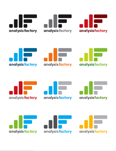
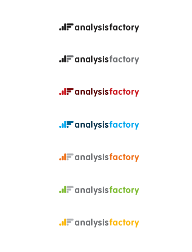
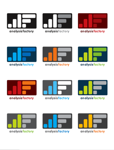
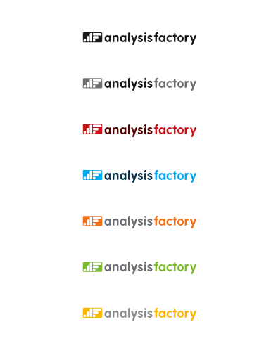
i have done a logo that they immediately liked, so now i am trying to narrow it down and work out the details. please review the 4 options (4 pages in various colors) and offer some suggestions for improvement. as far as kerning, i know i still need to do that!
the client wants a stacked version and a horizontal version.
| Attachment | Size |
|---|---|
| AF-logo2-4pgs.pdf | 703.75 KB |