Hi all,
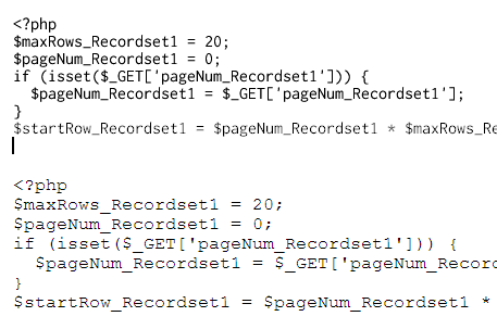
My Inconsolata feels just about finished now. I've added more or less all the characters requested, so that the basic Latin-1, -2, and -0 should be covered, as well as some other glyphs needed for TeX.
What I'd like now is critique of the fit and polish of the font. I'd especially like feedback on the accents and auxiliary characters, since I don't use those as much. I tried to follow the advice of Adam Twardoch and Briem, but not speaking Icelandic or Polish, it's hard for me to know how successful I have been. The font is available for downloading in various formats, so it should be pretty easy to use.
Hinting is very minimal. That means the rendering won't be super-sharp, but at least I have confidence that the shapes won't be horribly distorted, and it looks pretty nice in Linux on my 24" Dell monitor.
Before people lay into it, I know the "A" is stylistically a little out of step with other glyphs such as "V". But I can't bring myself to let go of it. I like the little touch of Eagle mixed in with all the other eclectic influences.
Thanks much in advance (width).
| Attachment | Size |
|---|---|
| showing.pdf | 31.53 KB |