Hi Typophiles,
I’m designing a logo for a flooring company. This is a starting business, very small for now. He has a license with the name “Imperial Flooring Solutions.” I notice there were other companies named similar so we came up with the “solutions” before he got the license. He was really sticking to the name because of a family tradition on a different kind of business.
In doing my research I notice almost every flooring company uses either floor tiles or carpets on their logo so that was one thing we wanted to stay away from. Another thing I noticed is that companies named “Imperial” in other fields always use either shields with lions or crowns (for obvious reasons) so that was something we wanted to stay away from.
Services: Laminated Floor, Vinyl, Carpet and installation of all these. No hardwood at all. Commercial meaning no small houses but big buildings. Big projects.
After this brief background research I came up with some adjectives with my client.
• Direct (client focus in direct contract)
• Friendly (Client focus on consulting, advising client for best solution)
• Empowering (to give a sense of confidence to the client)
• Growth (self explanatory)
• Dominating (Imperial, Empire, dominion over areas)
I came up with a set of concepts of which I selected four to explore. I’ve been sketching forever and vectorized another whole bunch but still feel some of them need help. As far as the type, its just my first draft combining icon with type so I haven’t locked up on any solution yet my only strong suggestion would be a slab serif for its rigidness compared to floors and buildings. He tends to like sans serif but serif seems to fit more for a trustable company especially in flooring business but again not locked up into it.
Any type suggestions are more than welcome as I’ve been having a hard time matching a typeface with each logo’s look, e.g. hard edges w/slab pointy edges w/serif etc.
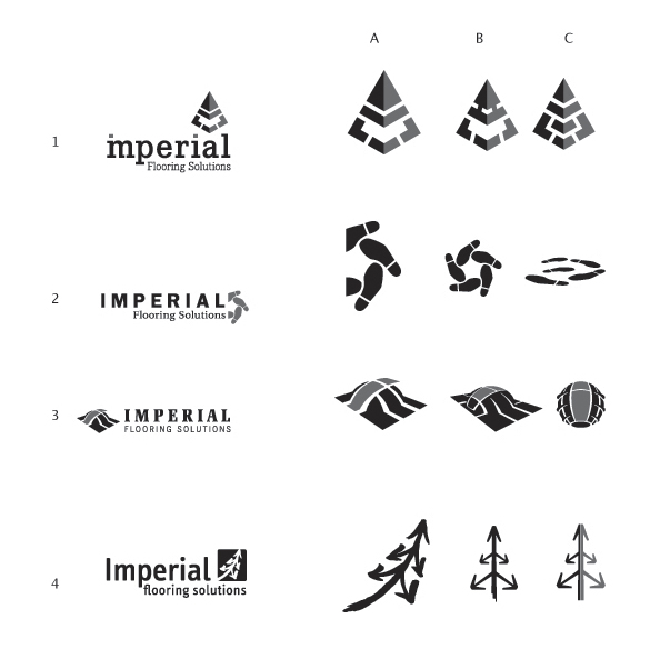
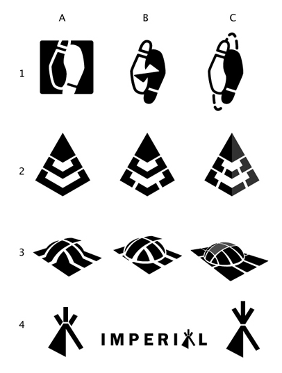
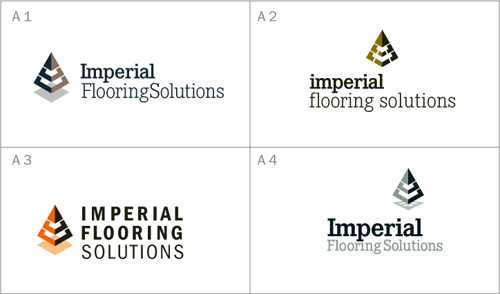
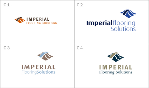
1) Concept one takes on the consulting part as well as relating a pyramid with empire. The horizontal divisions represent floors in a building. The pyramid is formed by a number of arrows coming to an end point, meaning different solutions guided to the best.
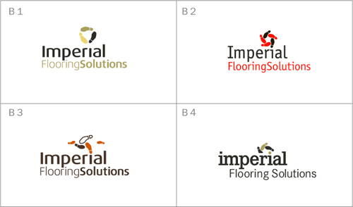
2) Concept two takes on the guidance part so like dancing lessons where they show foot steps to follow this idea leads to a center point. This on has been really hard to convey, it was selected only because I wanted at least three different directions. I thought the idea was clever but looks related to a shoe company.
3) Concept three takes on the word Empire or Imperial, overtaking territory. It’s a globe getting covered by floor titles and it highlights an “i”. Legibility on this icon has been difficult.
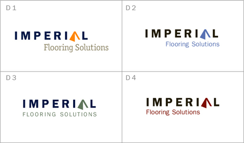
4) Concept four relates to the first one. This one combines Growth (as in a tree shape/arrow pointing up), Different directions (branches of the tree/arrows), and again the imperial pyramid/triangle shape. I started wit a geometric shape but then decided to try a hand made one to give it some human touch (friendly).
I want to present all four or at least three so let me know what you think/suggest specially type suggestions.
Thanks!