Typophile

New Face, Levin

dail

Hello,

This is my first post here, and this is my first typeface.

The face is conceptually based off the town planning grid of a town in New Zealand called Levin.

Here it is. I have quite a bit of work to do on the kerning.

This is the lighter weight version of the face.
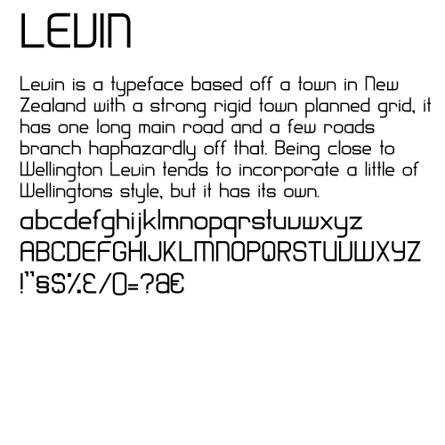
Any feedback is welcome. I realise that the characters are a little odd, but that conceptually was what I was going for.

I like this in general. Much of the lc seems too wide, while the uc is too narrow, relative to each other. But that might just be my opinion.

I see among your punctuation you have a "$" and a 2-story "a" which I guess could be an alternate or an "@". If it is the latter, it isn't recognizable as such, nor is the "$". While the vertical bar doesn't need to be continuous or even necessarily penetrate the outer contours, it still needs a little more of it. As it is, the "$" looks like an "S" with some obscure accent of some kind.

I like it
But maybe you have to work in the spacing of the characters, I really think that the words are too tight. The shapes must equilibrate the inner spaces with the spaces between gylphs. The kerning stuff leave it for later. Good Luck!

Nice. I think the crossbar of f and t are a bit too short.

Captured from web.archive.org on 23 Jan 2015. view this capture