
Hi,
I'm redesigning an existing corporate identity for a recruitment agency servicing construction, engineering and architecture in Australia. More accurately, I'm tidying up an existing corporate identity.
They've been doing business for a few years, and are reluctant to change their ID too much, and want it to remain easily recognisable. The original (that I didnt design) is a simple geometric mark using Bauhaus letters with Bauhaus also used for the company name.
You'll see, the original logo is a bit hard to look at. The whitespace seems quite odd, and the Bauhaus becomes unreadable at small sizes, the mark is also dirty at small sizes because of the gaps wear the bowls should terminate. I suspect they did it themselves.
The breif is to keep the same basic shape for the mark - but tidy it up so that it looks a little more solid and use a fresher, more readable typeface for the company name.
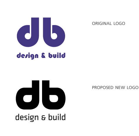
Obviously I dont have a lot of room to move - but any comments, critisism welcome.
Kerning 'build' gave me some trouble.

