Typophile

Schmale Runde Grotesk by Bauer & Co

thierry blancpain

dear typophiles

in a specimen book by Bauer & Co, Stuttgart (1600 pages - wonderful!) i found a font called "Schmale runde Grotesk" (Condensed round Grotesk). i digized some glyphs from a photo of a copy, some lines arent vertical and so on… its just a first test.
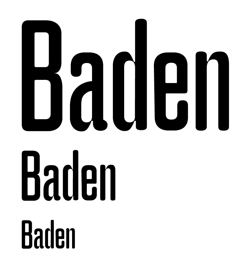
i have two questions regarding this font.

- the library wasnt able to date the book, but i'd like to know a circa date - so here the clues i have: on the bottom of each page, H. Berthold AG is noted beneath Bauer & Co - Bauer was bought 1897 by Berthold, as andreas mentions here. AG is shown beneath Royal-Grotesk, so i guess it was after 1908 (in the same post as linked above, andreas states that theinhardt was bought 1908). any idea?

- is there a reason for the very thin connecting parts in a, d and n? this feature is found in a, b, d, h, n, m, p, q, u.

thanks for your help!

What about the upper-case letters ?——those are indentations placed at the intersection of two strokes or a departure from the intended shape of a stroke near the intersection of two strokes of a glyph to provide compensation for ink bleeding or plugging during printing or overexposure from a photographic process.

Right there——quite cool.

What about the upper-case letters ?

Right. The principle is not applied consistently in the original design, or in the digital copies shown.
Why don't you have a go at applying the ink-trap conceit to the upper case Thierry, rather than just parrot the past?
Some original digital faces with an "ink trap feature": Bradlo, Amplitude, Chunkfeeder.

> Bradlo, Amplitude, Chunkfeeder.

But all of those use traps (actually the third uses thorns, not traps) in a decorative way, not for actually fighting gain.

In the case of Schmale Runde Grotesk, I have a feeling those weren't "real" traps either (not least because the caps don't have any trapping). One should look at a range of point sizes for clues.

hhp

thanks martin, i didnt know this font. i found this specimen at the libary of HGKZ (university of applied sciences and art, zürich), close enough to lineto. it seems like a direct digitalization of the font, so what i had planned doesnt make much sense anymore.

so nick, yes, maybe your idea could be something innovative instead of repeating what martha strutteregger did with it. i'll think about it.

alessandro, none of the UC-letters show inktraps. but, @hrant, as i found this specimen in a specimenbook (printed), i can be pretty sure that they were not intended as inktraps - because they're a feature of the design, not a necessity of the design itself. they're too extreme to be just inktraps. and they're featured in all sizes. as soon as i get a good scan of the original page, i'll post it. right now at home i only have copies of the book.

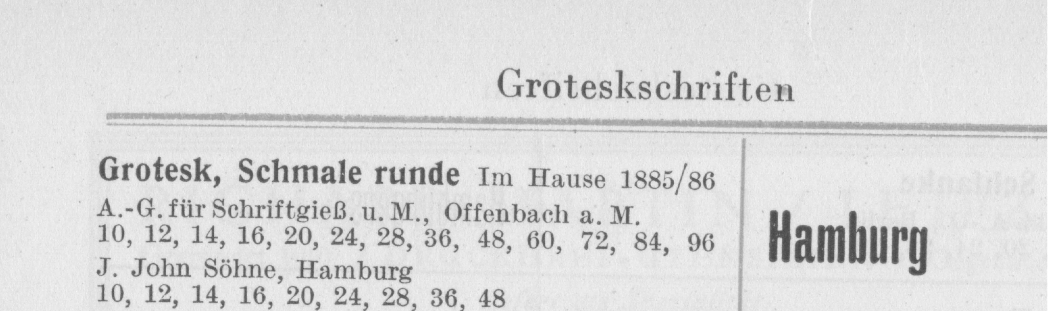
This is
Schmale runde Grotesk
A.-G. für Schriftgießerei und Messinglinien
Offenbach am Main
Erstguß 1885/86
Hausschnitt

Source: Seemann, Handbuch der Schriftarten, 1926

I am sure its the font you are looking for.


Georg

Re. Chunkfeeder -- my semantic slip, I was actually thinking of what Trapper (also by Jim Grieshaber) looks like, but gave it the wrong name. Which is strange, as the topic is trapping! -- I can only conclude that Chunkfeeder is a much more interesting name and got "trapped" in my memory, whereas the name Trapper makes me think of Davy Crockett, not type. Trappist would be a cool name too, and I would think of a monk ... reading in silence.

Trapper? There was a guy in M.A.S.H. called Trapper, was'nt it?

Georg

Germans looove old American TV. :-)
Hasselhoff could become chancelor in five seconds.

Nick: trappist monks grow trapping flowers:
http://www.themicrofoundry.com/ss_trapping1.html

hhp

"Germans looove old American TV. :-)
Hasselhoff could become chancelor in five seconds."

Well, some of it.
And Americans looove old German movies :-)

http://search.ebay.com/search/search.dll?cgiurl=http%3A%2F%2Fcgi.ebay.co...

Georg

Captured from web.archive.org on 13 Oct 2013. view this capture