
So here's the deal:
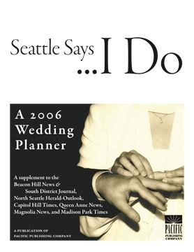
I put this together for a wedding guide put out by my publishing company. I had a few hours to design it, and this is what I came up with. I thought I was being clever with the black/white space, and it gave me an opportunity to use Garamond Premier Pro.
Here's the catch:
Every guy who looked at it thought that it was ok. Cool even. But the design was UNIVERSALLY LOATHED by every woman who caught sight of it.
We have a freelancer who also happens to be a wedding photographer, and she shot it down immediately. She said it was not "feminine" enough.
ARGH! That's what I thought I was making!
What do you think? How do you make something (more) feminine?


