
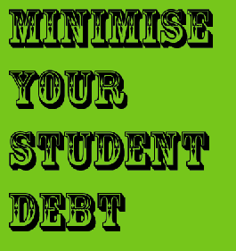

Rosewood Regular
http://www.myfonts.com/fonts/linotype/rosewood/regular/
It's a decorative/display font, conveys circus, wild west, 19th century woodtype. Use it for posters, headlines, etc.

…and it can be used for EVERYTHING western, of course.

Or, based on what I've seen in the past few years, it can be used for absolutely anything, especially if you only use the fill variant.
I don't think I'd use Rosewood (or Rosewood Fill) unless I was designing a poster for a circus or carnival. It's become very overused recently (as your example demonstrates).
- Lex
yup, its used a lot in mags etc. ive seen it quite a lot on jeans labels etc in a few stores. im using it for a little poster im doing. hope its ok in that context and its for students so hopefully ok. do you agree?

The problem I see in the example above is that "Student Debt" does not seem to jive with circus or western cowboy type. It seems to not take it seriously enough for the topic.
ChrisL

... or high end fashion ...
:^D
but remember the audience... it is like pyschology. ex: Perhaps it isn't that people that wet the bed into their teens, have low self esteem as a result, perhaps people that have low self esteem are more likely to wet the bed.
Or something like that...
Anyway, maybe the font doesn't fit the product or message but if it fits the audience you have to weigh the two. Just another view.
Design should never say "look at me." It should say "look at this."
Welcome Casey and I like your last line there, wish more people thought like you do.
The line is a quote from David Craib, Parable Design, out of Canada I believe, and thanx. There is an amazing design quote book I have called 401 Design Meditations, a wonderful book and collections of thoughts.
Other gems....
"Being a famous designer is like being a famous dentist."
______________________
CLB
Design should never say, "Look at me." It should always say, "Look at this."
this font may not be appropriate for student debt subject but as Casey quoted, i fully agree. This kind of typeface is in at the moment for this target audience so i think it seems ok. does anyone else agree?
Captured from web.archive.org on 2 Mar 2013. view this capture