Typophile

The Search: Part 3 — Serif For FUTURA (or) Sans For ADOBE GARAMOND

halloran

Hey there, I've been searching for sans and serif pairs for a while now.
I give great thanks to Crossgrove, hrant and anyone else I may have missed for all the help. You've been great.

So now, I'd really like to find a sans to pair with Adobe Garamond.

or...

If anyone knows of a serif similar to Adobe Garamond that might pair well with Futura or Akzidenz Grotesk...by all means, please let me know.

I feel as though I'm making a Christmas Wish-List. Ok, for all who may lend a hand, godspeed...
see you later,
Jaz

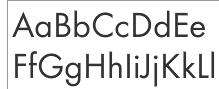
The samples below are Futura and Adobe Garamond.
I like my Garamonds paired with sans serifs that have a late 19th- or early 20th-century flavor:

The Benton gothics:
News Gothic
Franklin Gothic
Trade Gothic
Benton Sans (Font Bureau)

The unassuming grotesques:
FF Bau (FontShop)
Monotype Grotesque
Super Grotesk (esp. the B weight) (FontShop)
Maple (Process Type Foundry)

The more-interesting-or-at-least-less-often-used-than-Futura geometrics:
Metro
Erbar
Nobel (DTL or Font Bureau)
Proxima Nova (Mark Simonson)

Futura is surprisingly nice paired with Galliard, which has some of the same genes as Garamond. Something about the simplicity and hardness of Galliard and the proportions of Futura keep them in harmony.

But if you really want Adobe Garamond, which is much softer, you could look at Cronos, or one of OurType's sans designs might be right: Eva (new), Fresco Sans or Versa Sans.

I like my Baroque paired with a humanist. And two of them that has worked the best for me, believe it or not, are Scala and Quadraat Sans.

For a less common alternative, try Fontfarm's Kofired or John Sans.

For an alternative to Futura, try an architectural sans (how do we come up with such term anyway?) like Verlag or Neutraface.

I would not combine a Rennaissance-Antiqua with a Futura.
E.g. the italic version of Garamond is a very pretty one. Combining it with the Bauhaus style of Futura does not make sense for me.

If Futura with an antiqua, I'ld look for e.g. Memphis, Beton or a Monotype Rockwell.

Georg

Hey there, thank you all for your comments! Terrific and very helpful,
I really appreciate it. Ok, well, here's what I've chosen to do ( I may be breaking rules here, well I most definitely am at the looks of the posts here) I have chosen to use ITC Garamond and Futura.
Someone suggested to me yesterday (Avant Garde to go with ITC G.)

Since they are both geometric sans, Avant G. and Futura that is, (excuse my limited typographic vocab is somewhat limited) I thought Futura could work as well. They seem to fit together quite nicely for my purposes (and time constraints).

Well, I hope I do not disappoint anyone. I've got to do my own thing I guess, but this info you've given me is also priceless, and thank you for the support; again priceless, thank you very much,
Jaz

"I’ve got to do my own thing I guess"

That's it. Good luck.

Georg

Captured from web.archive.org on 24 Feb 2013. view this capture