
Typophile
They just can't get away from Trajan
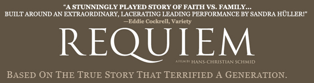

A "lacerating" performance..." Does that mean she left the audience in stitches?!?! Wow... what a cut-up!
DB~

What the designer did to that E is just tragic.
I think that it's because movie posters (and other promotional materials) have gone from being beautifully illustrated designs to quicky Photochops. If you want to make a Photochop look elegant, tossing Trajan on top is a logical (note I said logical, not good) way to go and doesn't require any real effort.
It might also be because Spielberg keeps using Trajan, and a lot of people in Hollywood will try anything to be cool like Spielberg, and since they can't make a movie like him...

I reckon it looks bewdy! Why are you going all berko over it?
Oh, do you think that it would be better to use that fancy font Requiem because it has the same name?
Muzz

> What the designer did to that E is just tragic.
You mean trajic.
hhp
Trajic! Bloody ripper mate!
Muzz
I even have a font of it:
http://www.themicrofoundry.com/ss_trajic.html
hhp
Crikey Hrant, have you thought of asking adobe to sell that for you?
Muzz
No, but I did once -stupidly- ask Emigre.
hhp

Ah, Dennis, your post was a cut above the rest :-)
ChrisL
Ah, silly buggers. Their loss ey?
Muzz

Multi-million-dollar budgets not only to produce a film but to merchandise and advertise it nationally, and they can't buy one lousy display font. How many other nice display caps are there for similar "classy" applications?
Waters Titling (recently used in ads for The Lady In The Swimming Pool)
Pontif
Cresci
Pietra
Throhand
Requiem
Mantinia
Michelangelo
Vendome
Perpetua
Aeneas
For starters.....

Having worked briefly, ever so briefly, in a firm that designed only Hollywood movie posters... I can say, yes, these people do not stray from Trajan. It was annoying as hell. Setting beautiful type never cut it. It looked boring to them. They wanted filters, bevels, drop shadows, and textures. It had to 'pop'. The most common reason for using Trajan: This movie needs to feel like Oscar material.
Maybe "Oscar The Grouch" material :-)
ChrisL

I like Trajan.
LOL! ok George :-)
ChrisL
I like Trajan on the Victoria's Secret catalogs. Man, those stems and bowls.
hhp
Trajan is lovely, I like it too, it's just been used to death, especially by Hollywood.

I like FS ROME better. One weight. Caps only. More elegant, IMO.
And again, if you HAD to choose ONE typeface for Hollywood to fall in love with, you could do a lot worse than Trajan. Like Papyrus or something.

Hollywood plz use comic sans, trajan is now overused;)

edit
Satya, funny!
hhp
Going back to that Requiem title, how many people are going to look at it and think,"is there something wierd about this? I can't put my finger on it." I think that the Trajan capitals have been ingrained into Western civilization to the point that even non-typophiles can sense when something is wrong about the E's.
I mean, what ancient Roman tool could chisel perfectly rounded ends? They look like amputated nubs.
I mean, what ancient Roman tool could chisel perfectly rounded ends? They look like amputated nubs.
Given the crap that Hollywood has been churning out lately, that's strangely appropriate.
But not as appropriate as titling all those movies in Comic Sans would be.
Satya, LOL!

Aaron Sorkin continues his love affair with Trajan in the title cards for his new show, "Studio 60 on the Sunset Strip." Now, Trajan made sense when used on "The West Wing," but it just looks like overkill for a show about a sketch comedy show.
Captured from commoncrawl.org on 26 Apr 2015. original URL