Hello all,
You've been a great help in the past. Hopefully, you'll have a moment or two give me a little criticism this time around.
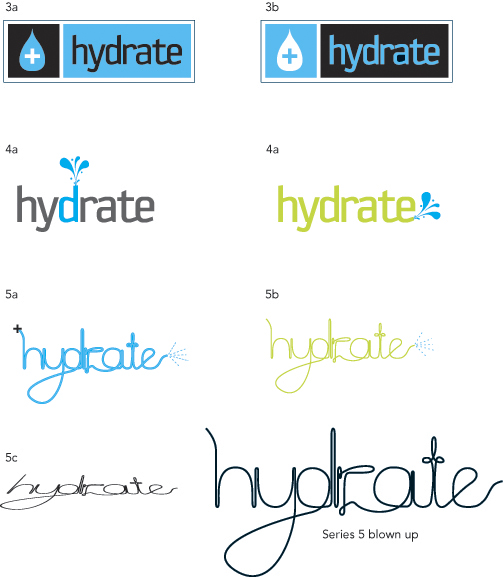
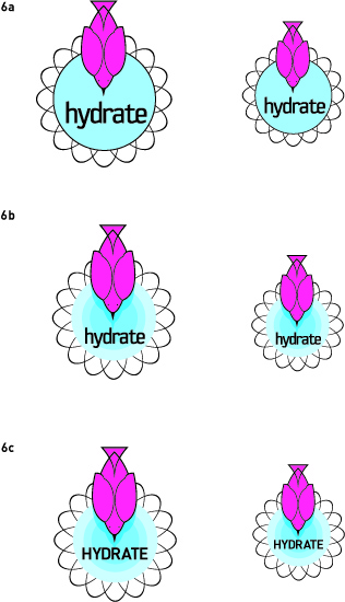
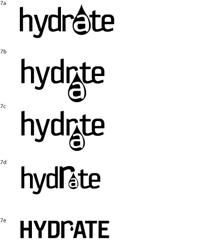
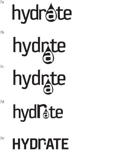
I'm working on a new logo for myself. Hydrate is now the name for my freelance design site. I've been working in two directions so far. Please let me know if you think either of these directions is worth pursuing.
FYI: I'm using the following definitions as inspiration for the logos
1. to combine chemically with water
2. To supply water to in order to restore or maintain fluid balance
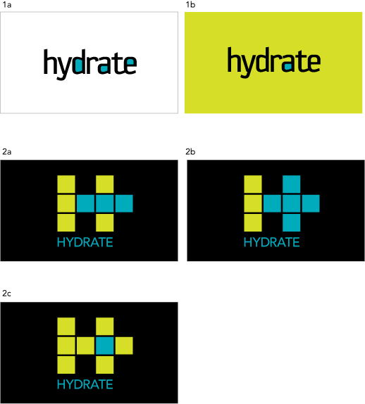
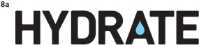
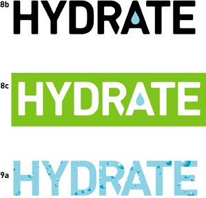
Direction 1: Uses Sophisto. I like the feel of this font. It has a techno/scientific feel that I like. I tweeked the the "r" and the "a" a bit trying to get a better relationship between the two. I'm not sure if that is working out. And I've filled some of the characters with blue to indicate water.
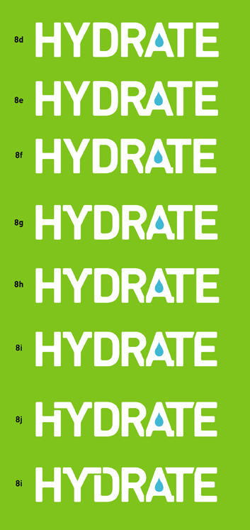
Direction 2: (I'm now staring at the typophile logo and thinking it looks very similar) Anyway the idea here is to indicate an "H" and a "+" symbol. The question is do you see the plus symbol? And in which one does it read the clearest? I'm using avenir below...not sure I want that.
Thank you for your help
Tamara
| Attachment | Size |
|---|---|
| hydrate.jpg | 91.57 KB |