Typophile

Clearview kudos

I drove to Pennsylvania over the weekend and, as I had hoped, saw some road signage in Clearview. It's as good as advertised - much better than Highway Gothic. Some of the warning signs were done up in too light a face, but that was the signmaker's fault, not Terminal Design's. Anyone else see it regularly?

That doggonne James Montalbano might just have something there :-)

ChrisL

Except for the Shenandoah Valley in full fall splendor it was the highlight of my trip. Clearview has a great M and a lovely l.

I used to see it all the time driving htrough Pennsylvania from New York. No question its more legible than Highway Gothic. My girlfriend and I would play the spot Clearview game on roadtrips. (We're both graphic designers aka nerds.)

I believe it's not just more legible. It also has just that little bit of style allowable in a font of this type. It's actually attractive. It would be interesting to see if James would admit to this characterstic. Maybe it's just so well thought out and competently done that it can't help being attractive.

Well Brad, I'm gald you think it is attractive. When Clearview was discussed on Typographica a while back a lot of folks thought it not.

AS to the too light warning signs, Black letters on light backgrounds (Negative Contrast) are a problem. We have designed a series of ClearviewHwy fonts specifically for Negative Contrast applications (they have a B in the name). All the fonts a a bit bolder and have tighter letterfit. As of this date the FHWA has not approved the negative contrast designs for use, but alot of copies are being licensed, so I think they may be making it onto the roadscape without the Fed approval.

On another note our ClearviewOne fonts (the general purpose version of the Highway fonts) are being updated to OpenType and should be on our website when our new site goes up in a few weeks.

Cyrillic versions are underway and we hope to add Greek this year as well.

James

http://typographi.com/000931.php _
All the negative opinions there were a haul of claptrap on the interstate.

Style: if I remember correctly James had initially toyed with the idea of proposing they use Syntax! :-)

BTW, will the non-Latins be promoted as highway signage in their respective countries?

hhp

Maybe most of the Typographica crowd don't have cars! ;)

Yeah, I responded to one of those negative comments on Typographica and got my post deleted!

One of the things I like about Clearview is it basic form similarities to the father of most modern humanist sans faces - Johnston's Underground type. I know Clearview is nothing like a copy of Johnston, that Clearview is much more sophisticated, and that there are many important differences. But the fact that James arrived at his face after exhaustive research and it still resembles Johnston at so many points says something about the genius of Johnston's work, and James's too.

Syntax was originally proposed for the National Park Service. We developed Rawlinson when they decided against it and any other sans solution.

The Cyrillic and eventually Greek are being created to potentially grow Clearview's use as a roadway signage solution. Who know how it will turn out.

I don't really see the Johnson Underground influence. British Transport was more of an influence.

I certainly didn't mean Johnston was a direct influence. But Johnston probably has to be seen as part of Transport's lineage.

I don't see many similarities to Transport and Johnston stylistically. Jonhston is far more humanist in its construction than Transport. Transport is a little more draftsman and Akzidenz influenced than Johnston.

I think a better comparison would be to Jock Kinneir's other design Rail Alphabet, which was one of the first sans serif signage faces (if not the first) to create both a negative and positive version of the design at different sizes to account for the optical trick of reversed out type looking larger.

Here in Pittsburgh, most signs are in Interstate. Some are in Clearview. Makes for a funky highway experience. At least for me....I hope some of it rubs off on other people, too, like my wife, who focus more on driving than on the signs. :)

-Jamie

Jamie,

None of the signs you are looking at are set in Interstate. Those you identify as such are Federal Highway Standard Alphabet Series Emod, E, D, C or B, sometimes referred to as Highway Gothic.

The design you refer to as Interstate is a commercial font derived from this design. It has never been used on the roadscape.

James

Terry - thanks for the reference to the Kinneir's Rail Alphabet. There doesn't seem to much info available about it. I suppose I see the Johnston similarities in the gross forms rather than the finer details.

"The design you refer to as Interstate is a commercial font derived from this design. It has never been used on the roadscape."

Thanks for clearing that up.

As an aside, I found an online forum on which some guys/gals talk about their font issues. Doesn't sound like there's a great system in place to ensure compliance. Makes me wonder if Interstate has slipped onto a sign here or there.

-Jamie

"The differences aren't as huge as those between Helvetica and Arial"

Wow, the laymen of our dreams!

> Makes me wonder if Interstate has slipped onto a sign here or there.

Definitely possible, since people have even cut the forms by hand:

hhp

Ah,

There's your sculpted tilde. Even asymmetrical. Imagine if there were just a recommended alphabet that had to be interpreted by an unknown number of skilled signmakers. Sweet.

That C isn't regulation either. How old is that sign?

Back when I first realized that all the smaller street signs in Glendale (and maybe further afield, and I do mean field :-) were handmade, an improbable mental image popped into my head, and I've never been able to get rid of it: a man gets a phone call at home from the city, turns to his wife and yells "hun, thems be needin' a sign fer 'Wabasso' by noon-like Thursdee", and the somewhat portly and very white woman in the other room whips out here scissors, pulls out the special black sticky paper stuff, and starts a'cuttin'. She used to REE-ly on this fancy maynooal with the pitchurz of how them city folk would rather have the letters on their signs be lookin' like if they had their druthers, but these days she just cuts 'em from her good ol' Germanic memory. Meanwhile, the husband goes to the shed in the back, pushes the goats aside, and PROH-seeds to cut some o' that white plastic or metal or whatever backing. He counts: W-a-b-a-s-s-o, makes 7, so 7 times 3, is 21, plus two inches on each side, makes 25, and WHAM, cuts the COH-rectly sized piece right up, and takes it back in to his old lady, god bless her steady hand.

BTW, that sign is nothing: you should see how distinctly egg-shaped all the "O/o"s are around here - it makes you think there was indeed one person doing all of them, and maybe she ran a chicken coop on the side.

I don't know how old they are. But when it comes to "missing"
shapes, like the tilde, anything can still happen to this day:

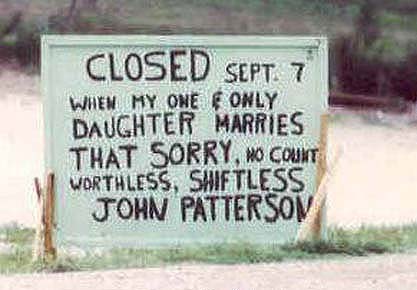
And here's the cruncher:


"Goldangit, just put in a 'y' ya smartass!"

hhp

God my sides hurt after laughing that hard.... Hrant. Did you take all those?

HELP WANTED - PART-TIME SIGNMAKER - Prefer very white woman, portly if possible. Germanic memory a must. Steady hand preferred. Goat ownership OK.

Maybe we shouldn't always share our enduring mental images...

All four of those are walking distance from my house - in fact two
are visible from it. Who says Glendale doesn't have variety?!

Brad, don't worry, I don't share the really good ones.

hhp

We're in trouble if Lozos takes the bait.

Now you've done it for sure.

hhp

“Goldangit, just put in a ‘y’ ya smartass!”
LOL. That is some funny sh!t!

ChrisL

ChrisL

ChrisL

chris...I'M AT WORK! shhhhhhh... :)

Was that a LOUD guffaw that your boss heard from the above posts or the 2 emails I sent before which brought the heat on you?

ChrisL

ROFL. Too funny.

Hrant: Up here north of Glendale we got rid of the tilde. Guess your signmakers got no cuzzins in the northern trailer parks. :)

I like the M's though.

You better like those M's or change your avatar :-)

ChrisL

"Where for art thou Patterson?"

ChrisL

Captured from commoncrawl.org on 25 Apr 2015. original URL