Hi Folks,
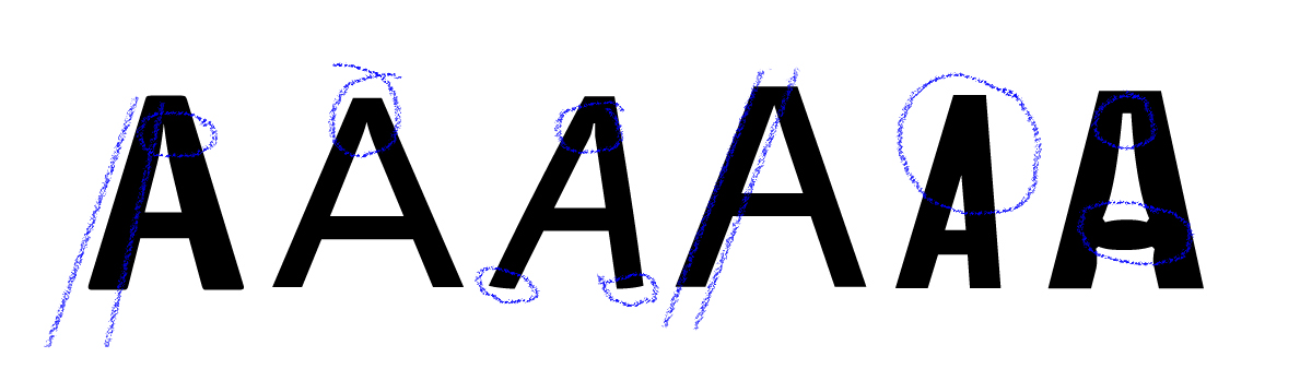
What do you think about those ink traps \ visual corrections at the joints_?
What are the thing which one should keep in mind while designing faces for various purpose like for body text, display or even in micro typography (like on the medicine labels ).
How all it works_? What if i keep the joints without these corrections_? Where they will start creating problem_? Sometime they really serve a purpose(like in Bell Centennial by Matthew Carter) but otherwise i don't find any strong reason having those traps. Is there anything beyond that which am missing_? I would love to know more about this.
Since its your daily job and hope you can answer it easily. Show me some samples if possible.
Thanks,
Satya_