Remember those stencil rulers?
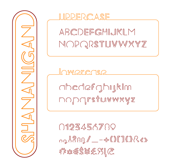
I just love these things & I just made a font based on them. It's a display font with a concept (seeing as I'm still a rookie & limitations can be a stimilating asset in the creative process, I find this an easy way to learn).
The concept was to make each character from one single -open; for that "stencil touch"- line to create a neon-like typeface.
This is only a first draft & I'm not too sure about some characters, but I like how some letters seem to be made from a double line (eg. E) & others merely seem to be a contour (eg. M).
I know in typography there are some basic rules to follow, but I voluntarely chose to neglect them to obtain just a cheap feeling as those rulers. This is only my second font & based on this & my first font, legibility doesn't seem to be prior on my list, but like I said: it's a display font & an easy way to learn.
| Attachment | Size |
|---|---|
| Shananigan.gif | 22.33 KB |