
I'll start: Braganza ITC.
I'll start: Braganza ITC.

I'm sorry, but I have to say it's one I've made. :-)

Geometrically it's not tilted, but thanks to those "faux serifs" it actually looks like it's tilting (especially in smaller sizes), and that's a rare attribute I've always liked in a hyphen (like in some really old fonts).
hhp

3D!

Never noticed the hyph-
ens in typefaces, will defi-
nitely let you If i lik-
es one from now.
---------------------------

Nothing fancy but a well-used em-hyphen excites me.

I'm sorry, but I can't work up much enthusiasm for hyphens.
Nick Cooke

The one betweem Muller and Brockmann :-)
ChrisL
I agree with Nick, this is a silly thread.
Perhaps Craig is having a laugh - 'Exactly how nerdy can these people be? I'll see if they can get worked up over a period, nah they won't bite, I know! a hyphen'.
Nick Cooke
It's definitely nerdy. What else is new around here?
But maybe one actually useful thing that can (more like might, eventually) come out of this thread is the realization that we don't use the hyphen enough; we're obsessed with fusing words - we think we're being efficient and/or modern - but in reality we're often reducing readability. Favorite example: readjust.
And once we realize that, this thread might then become more relevant! :-)
But really, in any case, half our story is minding the details.
hhp
Adjunct discussion:
Are there any issues with making a hyphen something besides -the expected- simple rectangle? Like maybe its potential (in fact common) usage as a minus?
hhp

Here's one of mine that I particularly like:
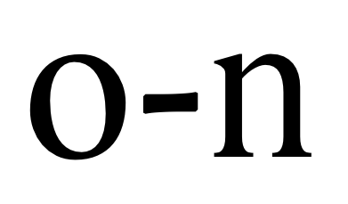

I'm not deadly serious with this thread, but my interest in your thoughts is genuine. Here's what led to the question: I am considering a wordmark design for a company that has a prefix as its entire name. I was thinking of using a crisp sans for the letters, but something more lively than a rectangle for the hyphen (which then might also serve by itself as a logo). This got me looking through the fonts on my computer, and I was surprised to find so few that were interesting.
@WurdBendur: I like it.
> using a crisp sans for the letters, but something more lively than a rectangle for the hyphen
The risk however is for the hyphen to drop out of a "reading" of the logo because it's so different in style, since it's an "outsider" character anyway. I think it can be done, you just have to be careful.
hhp

>What's your favorite hyphen?
Here's mine... http://www.hyphenpress.co.uk/
This one could be fun...
http://www.pubcrawler.com/Template/dsp_restaurant_zoom.cfm/flat/ID=170755
In Germany hyphens are illegal...
Looks like Si dashed right out and got a few links.
ChrisL

Too funny, Nick!
Anyways, my pick.
Awesome.
hhp
But having what I said earlier - that Braganza hyphen is pretty damn tasty!
The late, great Phill Grimshaw was one of my inspirations to become a type designer, he did some fantastic stuff, was so prolific, but died way too young.
Nick Cooke
>> using a crisp sans for the letters, but something more lively than a rectangle for the hyphen
>The risk however is for the hyphen to drop out of a “reading” of the logo because it’s so different in style, since it’s an “outsider” character anyway. I think it can be done, you just have to be careful.
I tried to be careful and here is the result:

Opinions welcome.
I think it's either too much or too little.
The hyphen stands out, but unsurely.
hhp

The proportions and spacing of hyphens are more critical than the plainness of their shape.
Here's a thought (for OT font developers), and it could also be applied to the spacing of punctuation:
Have two identical-glyph hyphen characters, but kern them differently.
That way you can use one for regular combinations, and the other for problem combinations such as Y-T, in the case feature perhaps.
Captured from commoncrawl.org on 27 Apr 2015. original URL