Typophile

node 28825

Yo, first post.

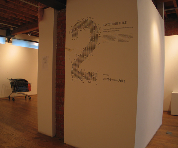
I was recently commissioned via a uni Live brief to work on a gallery signage system to be implemented within the next few weeks but being quite a fairly high profile job (for me) I wanted to get things right.

I’ve picked out quite a selection of faces to use, but the illustrator seems to have taken a fancy to ‘Beta Sans’ by Shiftype.

I just wanted to find out what you guys made of it, and if you knew any reason why using the face is a terrible idea..and so on…

AttachmentSize
metre.jpg67.38 KB
unknown

A local television station over here (Austria that is; goTV) uses ‘Beta’ for on screen type and actually I think it works really well. And it looks way fresher and nicer than whatever else is shown on TV. So I think it ‘could’ sure work for signage as well.

Dav

unknown

I guess I would need to see the illustrator’s work before being able to offer advive as to the appropriateness of the Beta Sans.

From an initial glance, I find the lowercase e and lowercase g charmingly disgusting.

unknown

Haha, fair point. Im presuming it would only get used for the gallery numbers and gallery title (caps).

Ahh well meeting at 11, have to see what they make of it

Captured from web.archive.org on 20 Nov 2006. view this capture