Typophile

node 28818

Hey Typophiles,

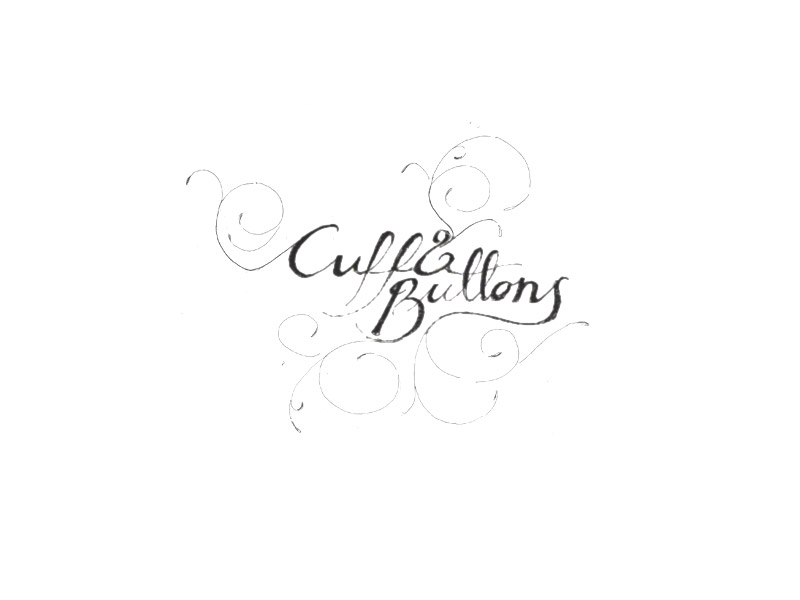
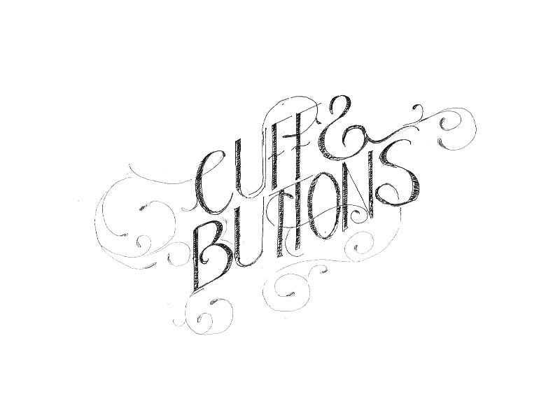
So I am working on a treatment for a high-scale catering company and just did some quick sketches (well not so quick for me…)

Here is the question: should I use existing fonts and then apply the ornaments or try to draw cleaner versions and then trace in illustrator….

I think for sure i’ll have to trace the ornaments in illustrator, but what about the fonts? should I use existing ones? any recommendations?

Any other suggestions or feedback are appreciated…

* I am not lazy, it’s just my caligraphic skills are very poor…. **

Thanks so much!!
-p

AttachmentSize
cb01.jpg23.04 KB
cb02.jpg41.75 KB
unknown

You seem to be influenced by Marian Bantjes (http://www.bantjes.com/). I believe she does all of her lettering by hand. I suggest that you try doing the same.

unknown

The second one seems a lot stronger to me (type and ornaments) and if you have the ambition to trace it, I say go for it. The ampersands seem a little off to me in both, but I’m not sure why.

unknown

The direction your second option is taking is really lovely. I wouldn’t worry about fonts at all. You have gone far enough, and if you continue, that this would work without having to find a typeface. IMHO that will help this have a more bespoke and precious feel.

unknown

I agree, you’ve already come a long way with your sketches, and it’s be wonderful to do a vector version and lean it up from there.

unknown

Second image: How about making the ampersand smaller, and/or maybe another colour? Unless you choose to change the actual shape of it. As it is, it looks too much like a reversed S, especially when there is a similar S just underneath, so the name looks like CUFFS

unknown

Thanks to all for the feedback! I’ll try to change the ampersand in the second one and then trace it….i’ll post my vectorized execution **nervous here**

and yes!, I was influenced by Marian Bantjes lovely treatments, I also admire Si Scott’s work

Also, any websites or tips on how to trace (i’ve read here and there that the less anchor points in my bezier curves the better, but I wonder if there is any theory behind it…)

Thanks again!!

-p

unknown

This thread may help, http://typophile.com/node/21006

I’d also be happy to do the production on your final sketch for a fee if you’d like. I do all the production work, varying from tight to rough sketches, for John Langdon’s ambigrams (http://www.johnlangdon.net), as a reference.

This image may also help you, if you decide to do it yourself…bezier handles revealed on one of John’s logos, his finish, not mine:

unknown

If I was preparing your second image to redraw in Illustrator I would rotate the scan clockwise to help keep more of the bezier handles on the vertical and horizontal. I would suggest that your S is rather wide, adjusting it will mean your last flourish will also have to be amended. I would also look at the usual stresses of the middle of an S.
Tim

unknown

Thanks Dave… I wanna do it myself as a learning process, if I get entangled I’ll let you know…the image is a great reference point!

unknown

Sure, just wanted to throw the idea out there. Glad the image is of help, good luck!

unknown

so I was thrilled to work on tracing this sketch (my first attempt)….still a work in progress, but wanted to get feedback :-)

Is the ampersand still too much like a reversed “s”?

Thanks again! -p

unknown

Your _S_ is a little wonky in the modulation of the stroke, it doesn’t seem as refined as the rest of the letters which are nice. Try making the Ampersand smaller, it’s definitely reading as a _S_ subconsciously anyways. Modulation on that is a bit wonky as well. Good start!

unknown

You will need thicker strokes on the U’s, C and B. I would also look at a narrower B and broader Fs and Ts. You might also add some overshoot on the curved letters. This might give you some direction for the S middle stroke, think of it as drawing it with a broad nib.
http://www.myfonts.com/fonts/urw/britannic/

Tim

unknown

As Tim wrote, you need thicker strokes here and there. Keep in mind that this mark will be reproduced at a fairly small size to fit a business card (or smaller), so you don’t want the thins to disappear. I am definitely reading the ampersand as an S, so work on that.

unknown

For the ampersand, remember that it is derived from the Latin “Et”.

- Lex

unknown

i miss the textured feel the letters had in the sketch. Also each letter seemed to have more personality in the sketch.

Captured from web.archive.org on 27 Nov 2006. view this capture