Hi,
I am developing an identity for a company called One-1 (the request was to use either "ONE", "1" or a combination of both) at the moment I am at an early stage of development and would like to look at alternative fonts from the current one that I have chosen (just to see what works).
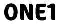
In terms of design this (attached gif) is the direction I am taking at the moment (although if looks very similar to another identity you are aware of please let me know)
The fonts used are "Reforma Grotesk Demi" for the ONE and "Reforma Grotesk Medium" for the 1 the use of medium to bring the kerning a little closer. The key for the font is not to thin and the number 1 requires the curve at the top (sorry don't know the technical name here) the curves just gives that little bit more recognition to the number then a straight variation.
Any thoughts on alternatives that I should try out - anything more modern would be good. One-1 is a fitness / personal training company.
TIA
| Attachment | Size |
|---|---|
| reforma-on1e.gif | 2.24 KB |