
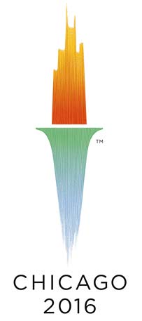
Has anyone seen the logo? Do we know who designed it?
(sorry for the potential misplaced query, but it wasn’t really a type id question)
PS, I love it.
(edited: Oct 26, 2006)
Has anyone seen the logo? Do we know who designed it?
(sorry for the potential misplaced query, but it wasn’t really a type id question)
PS, I love it.
(edited: Oct 26, 2006)

Hmm, I see the Chicago skyline on fire, sitting atop a giant spike made of ice.
Is that really the image they want to project?

I agree, Gil. It’s wonderful.
I like it too.

the TM spoils it :-(
Si
I see a torch......illusion

I think it is really nice as well. For the scale, that TM could be much smaller.

It doesn’t refer to the Olympics (a torch doesn’t seem specific enough), wonder if the rings will be introduced later. It is quite pretty I suppose, but is that the sole point?
Tim
The rings are a secondary element. The logo reflects the city in which the Olympics will take place.
Yes, however it doesn’t reflect or even hint at the Olympics, could be worse though
http://www.sccog.org/webapp/servlet/content/view/15/24/
Tim
Captured from web.archive.org on 5 Sep 2008. view this capture