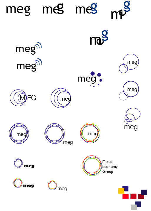
Its for a company called Mixed Economy Group (MEG) who helps universities get funding from the government to support colleges with both FE (further ed) and HE (higher education). So they are the core of it all if you know what i mean. these colleges would not get funded and would not run without them.
I want to give it a sense of belonging. I tried representing different coloured circles to represent different colleges but evolving round MEG because MEG is the foundation of it all. They are the core for those colleges/universities. how can i make it better? what typeface would be better suited for this. any ideas well come! thanks.
PS This is only the beginning of my logo. i am still in the process of making it work.i will keep updating it every now and then.