
Typophile
Hurt Majesty

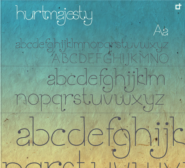

You have quite a fun, jaunty sort of hybrid serif/ballpoint script font there. I see what you mean about the "e". Curving the horizontal bar to form the letter into a graceful spiral is my first guess at a solution, but that might divorce it further from the design of the rest of the letters. Adding a ball terminal to either end of the stroke might resolve that.
The hook of your "t" interferes with the "m". You could try having that dip a bit below the baseline to allow some space in those close kerning situations, but then you might see problems in the "ty" combo if you take it too far.
Thankyou for the comments. I am working on that “e”. For the “t+m” its just for fun, so I couldn't really imagine that being a real ligature.
Perhaps I could upload a PDF file for better viewing next time?
yes, please do post a PDF.
The image you ploaded does not compress well in the PNG format. You would have managed a much smaller file size with JPG, but with a sacrifice of quality. It's not as big a concern as it used to be, but there are still people out there with modems for whom file size is a factor in enjoyably viewing images on the web.
This is true Jason. PDF attached :)
Captured from commoncrawl.org on 21 Apr 2015. original URL