
Typophile
New BBC 1 ident
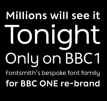

Interesting. I particularly like that litle quasicrypto-serif bit at the base of the T and the 1, and the right leg of the n.
Oddly enough, the last time I was cruising BBCWorld's website (earlier this week), I filled out their user survey, where one of the questions was soliciting my opinion on their logo. Do you know if the Beeb is doing a wholesale makeover, Tim?
L.
As far as I understand from the fontsmith announcement this is only for BBC 1, I'll watch some telly tonight to see if it affects the other BBC channels. I suppose the real test is how it performs on tv screens.
What did you think of the logo?
Tim

Hi Tim,
I worked on the re-brand typeface with Jason Smith here at Fontsmith.
The new BBC One channel identity will be launched on the morning of Saturday 7th October. The typeface was designed exclusively for the channel in collaboration with Red Bee Media.
Here’s a link to some of the new idents - http://www.youtube.com/watch?v=ofTBnuXpa-8
Phil
Thanks Phil, I'll look forward to it, youtube doesn't really do it justice. Was there a non-aesthetic reason for the slight out-turns on the verticals?
Tim
Tim: Yes, I do, in fact, I like pretty much all the grafix on BBCWorld (except for the nasty little newscrawl!), but without a monster plasma screen, I'm not sure I would notice much of a difference, at least consciously. ;-)
(The BBC Canada logo certainly hasn't changed either.)
Phil: Thanks for the link. Do you know (or can you tell us?) if the redesign will be extended across all their channels?
Linda

Somehow, the massive x-height doesn't fit my notion of BBC 1. Strongly suggestive of the 1970s, and hence too retro for Aunty. Please explain.

> Strongly suggestive of the 1970s
Well, the previous font Gill Sans was strongly sugestive of the fifties, so this represents a giant 20 year leap forward.
Good point Si, and I would agree up to a point, but Gill Sans has been a permanent fixture in the UK since the 1930s, so it's more like suggestive of the 20th century establishment, which would seem to be an obvious choice for such an institution as BBC1 (if not for Saab...)
I just wondered, since we have Phil who was involved in the re-branding, in this thread, what the discussion around the positioning of the face was, with regards to the 70s x-height thing.

all i knw, based on an assignment i did on gill sans was kind of ironic that Mr Gill had something to do with the BBC building in (date i forgot now) and all these yrs later, they decided to use his font.

Not really. Everybody still uses Gill all the time in the UK. It is the UK's corporate typeface.
Nick Cooke
Hi Phil, didn't you design Clerkenwell? Very nice!
Good bit of business - limiting the new font to BBC 1, ...now for 2, 3 and 4.
Nick Cooke
>Mr Gill had something to do with the BBC building
Ariel and Prospero amongst others, Broadcasting House was opened in 1932.
"Maidens are said to blush and youths to pass disparaging remarks regarding the statues of Prospero and Ariel" (Daily Herald, 1933)
Tim
I take it you're going to be watching tomorrow for the launch, Tim? Those of us in the colonies on this side of the pond will be waiting anxiously for your report. ;-)
Linda

That's a great typeface-I see it as an ultra-legible sans, similar to Myriad but a friendlier and a little less quirky.
And it goes really well with the hippos. Thanks for sharing this with us colonials–otherwise we might not have seen it till it popped up in a Comm Arts annual or something similar.

My first reaction was a bit shocked (to see new BBC ident) and very positive. Though you see the ident logo for a short period of time its has a strong presence and communicates a fresh and solid feeling. After seeing the first time - I knew I liked it and was looking forward to seeing again. I could tell it was from Fontsmith as has an attitude resemblance to the 'friendly media' itv typeface.
'one' is GREAT
I like the optical 'o' shape, I like the reference to Johnston's Underground 'e' (a bit like Gill sans) and I like how the 'n' has a subtle relationship witht he 'e'.
NICE
Agree that the relationship between n and e does make sense of the slight outturn on the n vertical, I felt that the font in text use, and admittedly I didn't see that much of it, seemed to have a tight fit. The circular imagery is still rolling out, I suspect that some will be more popular than others, for example circling hippos and wall of death riders seem better conceived and realised and more potential longevity than the football and moon/ships.
Tim
"Circling hippos"? I can hardly wait until the rebrand comes to BBCWorld! ;-)
Linda
>It is the UK’s corporate typeface.
Let's not forget Sweden! Gill is the face of Saab too.
>I can hardly wait until the rebrand comes to BBCWorld! ;-)
BBC America too! It will be a good distraction between endless re-runs of Cash in the Attic and diet pill ads!
:-) I actually rather like the telly ads for BBCCanada, so I hope they don't change too much.
(You mean you're not watching the new series of "How Not to Decorate" Si?)
Linda
Ads on the BBC, what is the world coming to?
Tim
Yes, I know.
Especially in the middle of "Top Gear" reruns.... :-(
What's really quite odd is that if one gets surveyed when surfing the BBCWorld website, it regularly contains a list of the current adverts that are supposedly running on it, none of which I've seen here. India has a bunch of them right now that we do get, and they're all acceptable, except for the English chap who talks about having surgery to his knee and it costing so little in India that he and the wife are on holiday at the same time. Talk about an indictment of the NHS....
Linda
Well, the ads are sometime better than the shows...
"Oh no, the collection of 19th century thimbles failed to meet our estimate, leaving only the dog eared collection of Beano comics and granny’s chamber pot left to meet our target. It doesn't look like the Smiths are going to get their dream greenhouse after all."
http://www.bbc.co.uk/radio4/excessbaggage/index_20060624.shtml
http://news.bbc.co.uk/1/hi/world/south_asia/3149454.stm
Medical tourism is quite a big thing among the chattering classes. The effect of ads on the BBC is that when you get an hour long programme we get 50 minutes, or, like the latest David Attenborough series, we get ten minutes of "how we did it" footage tacked on the end.
Tim
Si, that'd be the programmes presented by people with the peculiar colouration that only exists among TV presenters:) Not the highest point in broadcasting history, but a good time for suppliers of orange dye.
Sadly the true colour requires a PAL transmission, it's just not the same on NTSC
http://www.cbc.ca/canada/story/2006/07/06/china-falungong.html doesn't make me want to go to China anytime soon....
One side effect of the new typeface is the reduction of instances of Helvetica 25 on the telly, Orange Telecom seem to have gone with 55 now, others will follow.
Tim
Some of the new ident is now showing up on BBC World -- they've changed their bug to the new face, and, from the look of it, the supers and the "Live" tag as well.
Captured from web.archive.org on 27 Dec 2010. view this capture