Typophile

Great Serif Typeface

typewiz

I need some typeface help:

I would like some suggestions on some legible, readable and aesthetic serif typefaces. I am prepared to spend some money on a unique, characteristic, yet classic font for my History paper. Could you give me some advice? Thanks!!

~T

If you are prepared to spend some money, get Adobe Garamond Pro. Or Dolly. Or…, or…, or…

It's hard to tell exactly what you're looking for (doesn't "unique" contradict "characteristic"?), but I rather like Gentium, which has the added benefit of being free.

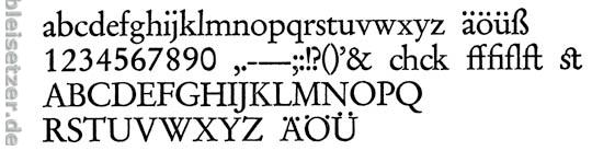
This is Garamond from Stempel. A very classy font, a real pearl of antiqua. You cannot do anything wrong with it. I agree with franzheidl "If you are prepared to spend some money, get Adobe Garamond Pro."

Georg

Preußisches Bleisatz-Magazin

Thanks, guys. I have been considering faces like Sabon LT, Bembo, Meridien LT, Minion Pro, Photina MT, Plantin, and Adobe Garamond Pro etc. for a while now. I particularly like the Garamond revivals - Sabon, Adobe Garamond Pro and Stempel Garamond, but I'm not entirely sure which would work best. And what are the differences between Sabon LT and MT; Adobe Garamond Pro and Premier Pro?

Typewiz, you have mentioned a number of fonts that can work well. But I think you cannot make the best choice in the abstract. You need also to think about the page layout.

Will you have large type or small? How long will the line be (measure)? How much leading will you use? And what is the mood of the subject matter, and the mood you want to convey as an author? Also, how will the final product be printed? By laser; by offset?

The answers to these and other questions will tell you more about what face is most appropriate. Of course, these will interact with the faces you try: if you have latitude you can try different faces with different layouts to come up with a good solution. For example, I think that the small x-height of Adobe Garamond Pro makes it work best at larger text sizes.

Oh, if you haven't read Bringhurst, do--you will find it a revelation.

These are also classy text faces, ANZIANO, DELICATO and TAROCCO. See them all right here;
http://www.macrhino.com

Thanks for your suggestions - I will basically have around pt. 12 size font, around 14 words per line. A formal, low-profile look is needed, and the final product would be printed by laser.

T

Here are some that may not be in the classic category...

Mercury

Whitman

Miller

And what is the subject/period of your history paper? That might also be taken into account. (This is partly the same as William's question about mood).

I'm not a big fan of choosing a body copy font to reflect the 'mood' of a document. Personally I think it's fine to choose display type this way but body copy should be chosen for broader reasons. Things like audience, shelf life etc.

My personal favourite is still Quadraat by Fred Smeijers. It's even more useful with the addition of a nice sans serif.

http://www.quadraatfont.com/

>14 word line

With 5 letter words and spaces that is 84 characters. This way too long according to traditional typesetting wisdom, as explained by Bringhurst. The traditional agreed ideal for single column pages is about two a half lc alphabets, or 66 characters. "More than 75 or 80 characters is likely to be too long for continuous reading."

Setting type on letter sized paper, if that is what you are doing, is a typographic challenge, and to meet it you need to use wide type, such as Century Schoolbook, and wide margins (or wide left margin) with titles or notes in the margin, or use a multi-column setting.

The typeface is probably a lesser issue than the layout for a good result.

As far as mood, I do indeed think this is appropriate to consider even in a text face. For example, Garamond gives a more traditional and Whitman a more modern impression. I think this character can enhance your message.

GC, what's your budget?

> body copy should be chosen for broader reasons.

Yes, but including mood. Just because a text font's mood doesn't hit
you over the head like a display face doesn't mean we should ignore it.

hhp

The word "mood" may not be the most descriptive way to say it. Type can have a visual effect or evoke a conotation as well as a mood. All of these are fair game in typography but success is not guaranteed. It can be enhanced though by a very skilled practitioner.

ChrisL

What software are you going to use. It is possible to get a much better than average history paper result in Word for instance, but you really have to push it around.

A good typographer will make Times look good, believe it or not, but if your choice of column width, type size, character spacing and feed isn't right, it won't really matter what font you use.

Bembo fan myself.

Never mind the content, what about the person who marks your paper?
Some clandestine research into their typographic taste might be useful.
If they have a "bible", the most-respected reference work (or a leading journal), or a work which he/she often mentions, it might be a good idea to set your work in the same face.

My kind of plan! :-)

hhp

Have you read this amusing article? Something like statistical evidence that essays in Georgia should get you higher marks than Times (and whatever you do stay away from sanserifs, at least from Trebuchet): http://www.aspiramedia.com/fadtastic/?p=79.

How about Hrant's Patria? That might be the proper mix of readability and zing, modern enough, yet has an international flare. It may just get the professor's attention.

ChrisL

Consider my Top 15:

1.) Sabon Next (Linotype)
2.) Garamond Premier Pro (Adobe)
3.) Dolly (Underware)
4.) Musee (DStype)
5.) Tribute (Emigre)
6.) TheAntiqua Sun, TheAntiqua B, TheAntiqua E (Lucasfonts)
7.) Tarocco (Mac Rhino)
8.) John Baskerville, or Baskerville Ten (StormType)
9.) Luminance (Mac Rhino)
10.) Bembo Book (Monotype)
11.) Scala (Martin Majoor)
12.) Freight Family (Josh Darden, Garage Fonts)
13.) Paperback (House Industries)
14.) Grad (Mark Simonson)
15.) Dante (Monotype)

Honourable mention: Palatino, or the supposedly original one, called Paltino Nova (Linotype)

I wanted to put the serif variant of Lisboa (Fountain) on the list, but that isn't really a serif in the most practical sense.

If I had to choose just one? Notwithstanding the particular application, Sabon Next. But I know I'll cry for Dolly. ;-)

Same for Dolly. Dolly first made me realise the existence of type. Still the default font for nearly everything on my PC. Works wonders at all text sizes. But I've tried it with my academic friends, and some did frown on it as just a tiny bit too frolicsome. Maybe I shouldn't have told them the real name, and called it Highbrow Oldface or something.

Yes, of course, academics love their austere, sharp Garamonds, or heaven forfend, Times New Roman. There's actually a much more varied and nicer version of TNR, but I doubt your academic friends would be aware of it.

Dolly exudes a warmth and charm that is very inviting. Its sturdy construction also gives a nod to the rich, dark type of yesteryear. As far as I'm concerned, Dolly is worth every penny. I'm just waiting for a fully opentype version with perhaps a few more ligatures.

Three others that deserve to be on my list but were left out:

Dorian (DTL) ---- The lowercase y and small caps are just brilliant.
Renard (Enschede) ----- Wow.
Elzevir (DTL) ---- Lots of variety here. Beautiful, dark type.

Storm's Jannon Text Moderne is highly readable. It is distinctive without being frilly or silly. And it's not pricey.

Open type at stormtype.com, TT (cheaper) at MyFonts:
http://www.myfonts.com/fonts/storm/jannon/

Absolutely. I like it as well, but there are so many Garamonds and "garamondy" - if I maybe so bold to use that term - types out there. I wouldn't mind seeing a new detailed review/comparison, or a re-evaluation of it.

> “garamondy”

Garalde.

hhp

Several questions: How should I cut down on the characters per line if I'm using Word? Or are there any better word processing/design software out there I should use?

And

Are there any fonts you would recommend which come with extended glyphs/ligatures/language functions?

I prefer the FF Angie by Jean-François Porchez.

> How should I cut down on the characters per line if I’m using Word

It's not about Word, I'm guessing that here it's about letter-size paper being too wide to strike a good balance between readability and economy. The usual solution is going to two columns.

FF Angie: I've always liked it.

hhp

You can reduce characters per line by: a. using a font that sets wider, ie has a longer lower case alphabet at a given size; b. increasing the size of type. c. shortening the line. That's about it.

Many reports and wide formats, eg instruction books, have a wide left column in which they put headings and information. Or, as I said you can go multi-column. Another way that looks good is to have two book style pages on a landscape oriented page. But as Nick said, if your audience is your teacher only, then you'd better do something that looks good to him or her--and that likely means 'normal'.

You can't really have control of layout in MS Word, just forget it. You can do better even with that, by controlling the face, length of line, spacing and margins in a single column, as well as nice headings, etc. But when it comes to putting stuff in the margins, multicolumn etc., Word is just torture. Even MS Publisher is better, though a proper layout program is the only way to go in the long run.

To get from 84 down to 66 with wider or larger type will backfire.

hhp

I'm a student, and I'm wondering if there are any examples of really beautiful but relatively "normal" academic papers online. 8.5/11 or A4 seem so simple but they're so hard to make pretty or even functional with only one column of text.

I would say Minion is a gorgeous and very versatile typeface, which has character without being so strong that it "steals the show". If I had to chose just one serif typeface to use, Minion would be it. Dolly is wonderful but expensive and maybe a touch too, well, I don't know how to put it, non-academic? But beautiful.

Clearface is my favorite Sans Serif. I use Georgia a lot too for books. But Clearface ahhhh drooling on keyboard.

Georgia for books??? ebooks?

Garamond is not legible - why are people suggesting it?

no, i use georgia in printed books. :) It's nice at 10pt.

That would be cool to see - can you post the tiles of 1/2 dozen or so - I'd love to pick up one or two for the library.

Cheers, Si

I'm not sure what you're talking about, sorry!

Would you explain, please?

That would be cool to see - can you post the tiles of 1/2 dozen or so - I’d love to pick up one or two for the library.
Cheers, Si

I didn't know what that post meant. Tiles of what?

Oh I just realized I said Clearface was a san serif oops....it's a serif. I'm sleeeepy.

>i use georgia in printed books.

>That would be cool to see - can you post the tiles of 1/2 dozen or so

Sorry meant 'titles' - I'd like to see some of the printed books with Georgia as the body face. Can you post some of the names of the books that you designed that use Georgia so I can check them out.

Ah ha! Titles! That makes more sense. By "books" I meant "manuals," as in instructor and student guides for iTi. You can't buy them. :( I'll attached a PDF you can look at though. It's 2 pages from 2 different iTi manuals. These manuals end up being around 1,000 pages and put in a huge binder.

Wait...how come I can't attach a file?? I swear I saw an "attach file" option before. Help!

Ah, okay. Thanks for explanation.

Like I said before, the font is not as important as the care taken over feed/spacing etc. Talk is cheap GC. Send me a sample text and I will treat it my way. I will post it - and if anyone else wants a bash at it - let them do the same.

And the content is more important than the feed/spacing etc.
Nonetheless we ]have to[ mind the details of our respective domains.

hhp

Hi, Please could somebody email me the font: FF Angie Small Caps. Or if you don't have that particular font then please send FF Angie.

Email Address: oliver.storey@blueyonder.co.uk

Thanks,

O Storey

I like Adobe Garramond Pro, but i'm kind of new.
Just what ever you do; do not use times new roman.
_____
®
™ɯɐs ʎʞɔıɹ

ostorey,

Did you know it was illegal to give someone a font? It is like stealing.

ChrisL

It is stealing. :o)

I realise that, but I really need that font and I am not prepared to pay out hundreds of dollars for it. Do you know of a free alternative or something?

Thanks,

ostorey

and, why should i not use Times New Roman?

Last time I checked FF Angie SC was not ‘hundreds of dollars’ but rather $42. If you need it so badly, why isn’t it worth anything to you?
For alternatives, check out this list. None of them is free. Why? Read about The Value of Type.

Or read the FAQ Free.

> why should i not use Times New Roman?

Well yes, you'd have to answer that first. We know the answer. And really, you do too, otherwise you wouldn't even be here.

Oliver, nobody can force you to buy a font, but you can certainly force yourself to not swipe one.

hhp

"but I really need that font and I am not prepared to pay out hundreds of dollars for it."

So we're exempt from paying for things if we happen not to have budget for them? How about this: If you can't afford it, you can't have it. Isn't that the way it works with other things, or are you inclined to steal things generally, like gasoline, books, food, housing, graphic design software?

It's a weak argument to say the font is hundreds of dollars when each face is around $42. I'm tired of people making this excuse. All it takes is a few moments to look around at your favorite font store to find a package that suits your budget.

I see no reason why you shouldn't use Times New Roman. It seems to fit your budget.

Why not just write it out by hand? That would certainly be way cheaper and not be stepping on any EULA issues?

ChrisL

Thank you all for your help. I pruchased the font and it is very good!

ostorey

Awesome.
Thank you.

hhp

BRAVO! I retract my snide remark.

ChrisL

Great. I’m glad that you liked my suggestion. It’s also nice to hear you’ve bought a licence rather than stealing one. I know, this is good for your karma ;)

Captured from web.archive.org on 27 Dec 2010. view this capture