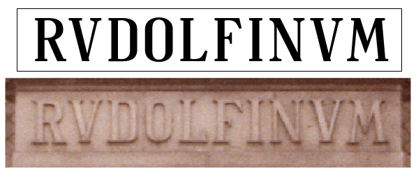
I've been working on this... I don't really do this kind of typographic work usually so I am a bit lost... Would someone point me to some really obvious mistakes that I might have made? It is not supposed to be a complete copy rather than a slight remake... The bottom serifs on the Vs are totally weird.. the M is also a problem... I also don't understand what is happening with the bottom serif on the L wich appears to be pointing backwards - it might be some kind of kerning... I am not sure...
I will be very gratefull for any comments...