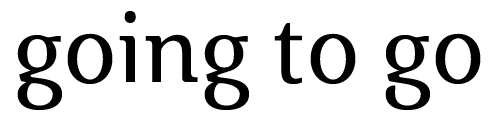
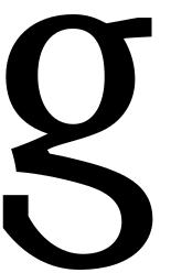
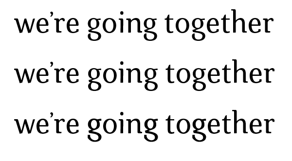
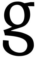
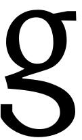
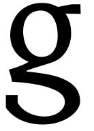
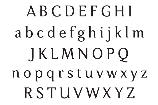
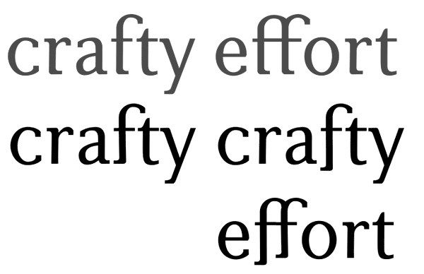
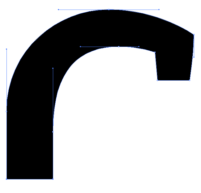
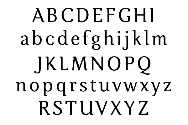
While I haven't posted much, I've been reading the boards (especially the critiques), and have gotten a lot out of looking at everyone's comments. As a design student and beginner in type design, I'd really appreciate any input you might have on this face, not only regarding technical inconsistencies between individual letters, but also your overall impressions, etc. If any of you were at the TypeCon 2006 TypeCrit, you may rememeber this as the "other" semi-serif that was present. It has no name as of yet.
Thank you in advance!
David
| Attachment | Size |
|---|---|
| specimen v19.1.pdf | 416.92 KB |
| specimen v21.pdf | 416.73 KB |