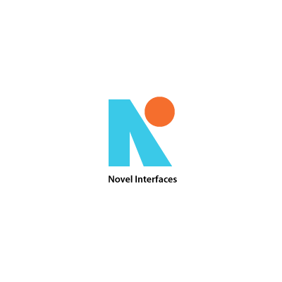
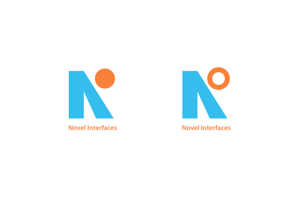
I'm sure there are many examples of Company Logos consisting of the letters 'NI'. However, I'm having trouble finding them. I'm keen on seeing how other designers have handled what is otherwise a very bland combination of letters. Aside from the diagonal in the N, there isn't much to work with!
Can anyone make any suggestions?