Typophile

node 28309

Hello, this is my first post here, I’ve seem some great work and I’m hoping to get some critique…

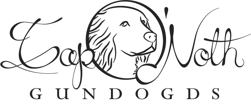
I’m putting together an identity for a friend’s business, this is one of the logo candidates.
I’ve had no experience in drawing a script face before, and wanted to know if anyone can spot any major bloopers?

An thoughts on the logo in general would be nice too :)

AttachmentSize
logo2.gif17.68 KB
unknown

Noth works. I think Top would work more if it weren’t overlapping. the O’ gets lost because of the image within it. The quality of the letters is light and airy and has a nice not over-done quality to it.

What are your goals?

unknown

Just in case… don’t forget to check the spelling before sending it to the printer’s.

unknown

If it’s called ‘Tap O’Noth Gundogs’, the a in ‘Tap’ is not too clear imo. It could either be an ‘o’ or an ‘a’ (it is very similar to the ‘o’ in Noth).
The O’ indeed is a bit lost because of the image. I’m not sure if I like the fact that the ‘tail’ of the N is filled white when overlapping the O. And is it ‘gundogs’ or ‘gundogds’, like in your image?

Anyway, apart from the critique I may have, the letters are very nicely done on themselves. Especially the Noth part, and the capital T. Keep it up.

unknown

Just noticed an extra “d” in GUNDOGS. You’ve spelled it “GUNDOGDS”

unknown

Thanks for the (lighting fast) feedback.
All excellent points :)

I’ve reduced the roundness of the stalk in the ‘a’ and made the loop in the ‘o’ larger, hence distinguishing the letters better.

I’ve moved the ‘p’ off the ‘O’ and taken out the white counters, which as suggested brings out the ‘O’ better and makes the whole thing more readable. A clearance area has also be made around the inside of the ‘O’ to try and stop the image hiding it.

And err.. gundogds :| it’s late !

unknown

The ‘a’ in Tap is actually much more readable now, nice one :)
The clearance in the ‘O’ does work, it’s more an ‘O’ now. However it still also does look like a frame for the image a bit.

unknown

I didn’t see the ‘O’ as well. Not sure if putting the dog inside works. The curve where the bottom of the ‘T’ loops back towards the left looks kind of strange. It should flow a little better. Also, watch your apostrophe. It’s looking like an inch mark.

Having said this, I really like your script’s style.

- Lex

unknown

I think the th could do with a bit of extra weight in the verticals they are a little unbalanced compared to the ap of Tap. The top of the dog’s head looks a little flat.
Tim

unknown

I just thought of something that might make the ‘O’ read better - try putting a loop on the top right as an exit stroke. You’ll probably have to make the dog smaller, or put the loop behind the dog.

- Lex

unknown

Thanks for the further advice, If my friend goes with this one I’ll make the suggested changes.
Lex, I was thinking about making the ‘O’ more handwritten :)
timd, thanks for the spot on those verticals, its difficult to notice these things when you’ve been staring at it for hours.

unknown

They loved it so I’ve made the suggested corrections (plus a little more flair here and there). I think it’s there now, do you agree?

unknown

A touch more stress on the lefthand side of the o in Noth and I agree.
Tim

Captured from web.archive.org on 1 Dec 2006. view this capture