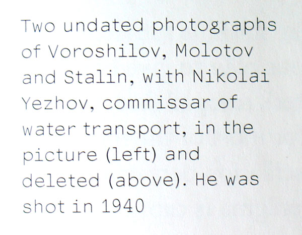
Anyone has a clue what this could be?
| Attachment | Size |
|---|---|
| whatthis.jpg | 54.83 KB |
Anyone has a clue what this could be?
| Attachment | Size |
|---|---|
| whatthis.jpg | 54.83 KB |

I don't know this one but that g and e is just plain ugly.
:) It actually looks like an uglified courier sans... I like the e and g.. it brings a sort of quirkiness to it...
Found it, it's Everson Mono by Michael Everson.
yay! it is! how the hell did you find it?
tnx!
No offence intended (to you or the designer) but g is so ugly, I figured that it had to be on dafont.com—which it was.
:))
Captured from web.archive.org on 18 Oct 2013. view this capture