
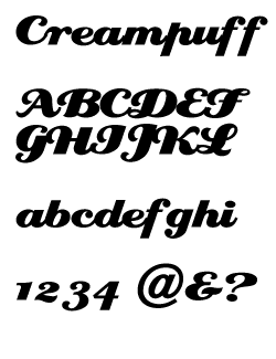
Are these based on a font that you know of?

Are these based on a font that you know of?

Doyald Young's Eclat.

Doyald has released a condensed follow-up to Eclat, called Home Run Script.
Man, I knew I knew it from somewhere. How could I have forgotten Doyald's work?!

clearly a rip ... but the free Creampuff might suffice
----------
Paul Ducco
Graphic Design, Melbourne
A rip indeed.
Doyald's fonts are great, I wish he'd make more of them.
His teaching leaves little time for it. I believe if he had an assistant to do the Fontlab work, he might be much more productive. Hint to all!
INRE, Creampuff
Shameless. Please buy Eclat instead. Doyald is a great contibutor to (and educator of) typography. He deserves all our support.
I agree, purchase Eclat. Not only is Creampuff a rip, it's a bad one at that. I thought it was THE original, now I know better.
----------
Paul Ducco
Graphic Design, Melbourne

We once had to work on a design that used Creampuff. The font performed so poorly that we bought a license for Eclat and substituted it. The client nor the "designer" of the original piece ever noticed, and we felt a lot more comfortable.
Well done Yves! Love the new blog -- any chance of an English version?
Hahaha, everybody's asking me that! :^D
Like I said -- I'll talk to da boss. ;^)

This subject seems to come up every few months, and certain people seem determined to beat a dead horse. Please have the courtesy to read the ENTIRE thread that Stephen posted first above. Yes, Creampuff is a rip; yes, it sucks as a font; yes, I apologize (again) for attempting to learn the craft of fontmaking from an acknowledged (and revered, it seems) master. Enfin, pouvons-nous mettre ceci sujet au repos?
did I miss something?
----------
Paul Ducco
Graphic Design, Melbourne
Apologies oldnick, I didn't see the link in Stephen's "a rip indeed" post. As to that matter, I think we could use slightly higher contrast for link colors or at least some more style differentiators (e.g., bg color, underline, or dotted/dashed underline) for links in body copy here on Typophile
-t

I remember the Letraset Catalogue (just because I am an old geezer) and have used it many times myself to choose transfer type to spend fortunes on. The genre of lettering is related to old baseball team names but there were plenty of old "commercial art" sources as well. Doyald did a splendid job of drawing and bringing Eclat to life.
ChrisL
Captured from web.archive.org on 12 Nov 2014. view this capture