
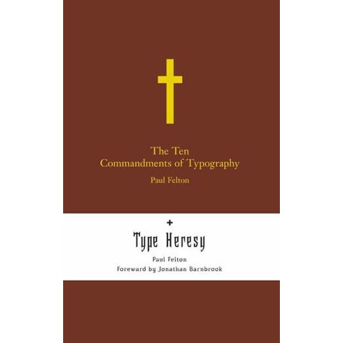
Not quite in print yet, have they got time to save it?
Nice to see you back again.
Tim
Not quite in print yet, have they got time to save it?
Nice to see you back again.
Tim

I guess I am missing something. Is this a real book coming out or a joke?
ChrisL

It sure looks like it could a real book to me, and an interesting one at that. Where is the colossal error? The tongue-in-cheek religious play?

It's the misspelling of foreword, silly.
Spire gets the gold star and two of you stay behind after class:)
The book isn't out yet but it is on various book-selling websites and appeared in Design Week (a UK trade mag) yesterday with that spelling.
Tim
…I guess that shows everyone how good of a copy editor I am ;-)

Maybe its ment to say 'Forward'? :)
Its always 'forward' with Jonathan Barnbrook, never 'rewind'. :)
( But I dont really 'see' the 'by'. Maybe 'forward' = Barnbrook? :)
Nice find, nonetheless.
Dav

I believe--but could, of course, be wrong--that this is still an accepted spelling of this word in England.

Am I the only one that thinks this a really ugly cover, with bad typography? Maybe this--including the typo--is supposed to be a joke. Violating all the ten commandments or something.

As PR stunts go, I have to say this one is pretty sad :-(
Si
My foreward shall be drawn out all in length,
Consisting equally of horse and foot.
- Shakespeare; Richard III, Act V, Scene 3
I don't think this was ever the correct spelling of the word in England, certainly not in any current use, the above is the only quote I can find and means a vanguard (a guard sent ahead); but it could still be a joke, however weak.
Tim
And I'm guessing these are errors too
http://eggcorns.lascribe.net/forum/viewtopic.php?pid=1117
I'm pretty sure from the this description of the book that my interpretation of the bad typography and typo is correct.
Well then that is too bad, as the humor is going to be lost on a lot of people.
"Am I the only one that thinks this a really ugly cover, with bad typography?"
No, that is why I asked if it was a joke. It is ugly as sin (punintended) to me but not executed in such a way as to amuse. If anyone has ever seen the old film "Plan Nine" they will know that is so increadibly bad that it is a joy to watch and laugh your guts out. This cover, on the other hand, is just boringly bad and needs to be excomunicated or excorcized.
ChrisL
(I know my spelling sucks)

A friend of mine works as a designer at that particular publisher and assures me that the typo is just that, not an intentionally antiquated spelling. Steps are being taken to rectify the error as we speak.
Instead of sniping why not be constructive and say why you dislike it? You never know who might be reading...
>A friend of mine
Come on Chris G, "a friend" ;-)
>Instead of sniping ... You never know who might be reading…
I think everyone who posts to threads like this hopes the 'culprit' is lurking and will respond - the most interesting typophile threads start that way... (The iPod-Che-Nike thread being an exception).
"Instead of sniping why not be constructive and say why you dislike it?"
The difficulty in this is that your cover is supposed to be bad on purpose so whatever is specifically wrong is obvious. My objection is that the parody has not gone far enough to make me want to look at it. I think you could have done more with the heresy aspect. The problem is that it is just boring looking. Having a concept in your mind of doing bad typography as a joke is not enough. You have to execute it so that it works. It still has to function as a book cover and do its job. If I saw this at a bookstore, I would never have given it a second glance. I would not have looked at it long enough to see that it was a joke. It just melts into the visual clutter. The only half-way saving grace in it may be an accident--the two brown rectangles appear to be the negative space in the letter "H" which may be Heresy. Other than that, snore zzzzzzz.
ChrisL

... say why you dislike it?
Not to put too fine a point (sic) on it: they could send a lot of wordspace (or should that be wardspace?) to some worthy cause that may not have enough. Every line is set in that awful default: 100%, which looks particularly nasty in the headline “Type ... Heresy”. Or is that large gap an intended illustration of itself?
Unless I'm mistaken, it looks from the Amazon UK picture that the white on the sides is not part of the cover, so the 'H', which Chris finds a redeeming device, isn't there. Ouch.
Ok, I'm game. Here are my commandments of Typography (pinched from others):
1. Thy type shall be legible.
Obedience here.
Ok, but now downhill.
2. Thy visual hierarchy shall express the conceptual relationships of the author.
Violation.
The idea of the book is a duality: Those who represent classic type wisdom and obey the rules, including Tschichold and Spiekermann, verses type 'heretics' who break the rules.
Here there are random sized bits of brown and white, no relation. A way to do this would be to split the cover in half, eg horizontally or diagonally, with one side black on white and the other black with white knocked out, or red and black or another two colors. The border could look like torn paper, indicating visually the opposition and disruption. I don't know if this particular concept would work, but it would be a. more visually arresting and b. reflect the idea of the book. Both a plus.
...to be continued...
3. Thy placement of type will have a pleasing relation to the space it occupies.
Violation.
Aside from being centered, the type seems to have no visual logic. Does the shape of the cross relate to the top brown block? No. Does the Cross plus the text relate? No. Why do we have a short line, long line then small short line, followed by a new color with lines all different lengths again? Why the color block again at the bottom? I at any rate can't see any rhyme or reason.
Part of the problem here is the two titles and subtitles of the book. The full thing according to Amazon: The Ten Commandments of Typography/Type Heresy: Breaking the Ten Commandments of Typography
Now having two titles and subtitles is breaking the rules. In my opinion this breaking can be ok because it has a compensating benefit: it is an arresting, interesting opposition. But the cover doesn't have the whole two titles, so the whole thing becomes a muddle. The point is, if you are going to break rules, you need to make a virtue of it. It has to have a strong point. Here the point is just lost because the two titles are not even put on the cover!
But--back to placement of text--as it is there is no rhyme or reason to the placement. And that is what looks most weak in the layout.
4. Thou shalt keep logically related words visually together.
Violation.
The important concepts are: 'Ten Commandments' and 'Typography'.
So the designer *breaks up* the words 'Ten' and 'Commandments'!
The other key concept is "Type Heresy", which as Erik Spiekermann points out are separated now by a double word space or something.
3. Thy typeface shall be well suited to the subject matter.
Ok if the top title were in Sabon (Tschichold) or Meta (Spiekermann) that would make sense. But it's not, it seems. Since the subject is actually type, I don't understand why the avoidance. Also is the 'Type Heresy' one of Branbrook's fonts? Maybe but I couldn't spot it checking. Why not use Mason or one of his other wonderfully disturbing faces?
Also why put 'Heresy' in black letter and Ten Commandments in Roman? If you are playing on the association of Church and Blackletter, then *both* should be in blackletter. The two titles should also be massaged so they are parallel. That is a failing of the author or publisher, but the designer could ask. Then perhaps you could have 'Ten Commandments' twice in black letter, and 'Heresy' in Mason.
4. Space and size thy lines, word spaces and letter spaces in a way that suits their function and purpose.
Violations.
Why is the top title smaller than the bottom title? Why is the second subtitle in a different font again? Why is the second time the author mentioned smaller than the first?
I could go on, but I'm now tired of the game.
As others have said: if this was trying to break rules in a funny way, it doesn't succeed. If it wasn't trying to break rules, well it does, all over the place.
>the ‘H’, which Chris finds a redeeming device, isn’t there. Ouch.
Ah, Chris obviously saw a 3pt field goal opportunity, looks like he's knocked it wide right setting up good field position for the opposing team. William capitalized with an additional 6 unanswered points. ;-)
"...Chris obviously saw a 3pt field goal opportunity..."
3pts? I don't know Si, that cross bar looks like it is at least 72pts high to me, I am throwing in the red flag and challenging that call :-)
ChrisL
After further review...
Doh!
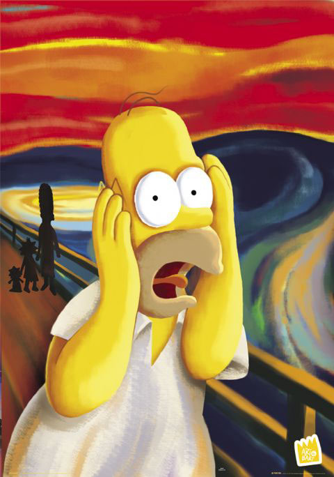
:-)
ChrisL

Hey, doesn't the title look like " letterspaced lowercase? "
Thou shalst not shag thy sheep!

Good Advertisement! Ask Dezcom?
Come on Chris G, “a friend” ;-)
LOL! :) So cynical Sii... believe me I would love to be doing some book design, particularly typography books, but am currently at an ad agency doing design of a more ephemeral nature. My friend at Merrell is lurking on the forum and has no doubt taken on board your comments - thanks to everyone for their input
Thou shalt not covet thy neighbors sheep.
ChrisL
>LOL! :) So cynical Sii…
;-)
>My friend at Merrell is lurking on the forum and has no doubt taken on board your comments
Blessed be the lurkers for they shalt inherit the advice, (whilst cloaked in a veil of secrecy)
> Thou shalt not covet thy neighbors sheep.
Dezcom, How if the neighbor insists? Rights of Neighborhood?
LOL!
Then you just give him that sheepish grin and tell him you can't do to health reasons :-)
ChrisL
How if healthy, wealthy, wise and welcoming .000O________________O000.?
:^D
ChrisL
Learning to see is harder than learning to look?!
I wonder where you saw that?
ChrisL
I do believe we are now participating in something called 'viral marketing.'
That struck me as well Eric.
ChrisL
Five Stages Of Grief
1. Denial - "Is this a real book coming out or a joke?"
2. Anger - "Am I the only one that thinks this a really ugly cover, with bad typography?"
3. Bargaining - "Instead of sniping why not be constructive and say why you dislike it?"
4. Depression - "As PR stunts go, I have to say this one is pretty sad"
5. Acceptance - "I do believe we are now participating in something called ‘viral marketing.’"
Si,
You forgot one Step
6. Resignation--I resolve to never buy this book.
ChrisL

I guess Barnbrooks ideas go somewhere close to what Bob Gill once said.
"If this deliberate typo only creates one thread on Typophile and annoys only a handful of visitors there, then all of the months I spent putting it together will not have been worth it."
ƒ

also, wtf is up with the bizarre break on the front?
the ten / commandments? why break the principal subject onto two lines? very odd looking to me. Ruari would not be pleased.
---
jlt : http://www.hewnandhammered.com : rnrmf!
Hello Everyone,
I Hope everyone is well. I'm the author of the book you've all been discussing, so I thought who best to answer all your questions than myself.
Firstly, I would like to say please don't judge the book off this picture, Originally this picture was created for the sole purpose of showing the printers where the foil was intended to go and was produced incredibly quickly (hence the spelling mistake, no it wasn't a stunt!) This picture has now been used on pretty much everything, which I wouldn't say I'm over the moon about really, but thats one of those things, Very well spotted though!
Regards the line break on the cover, I considered the title to be too long to occupy one line and ideally I wanted to keep the 'ten commandments of typography' part together. If you think thats odd then thats fair enough, I respect your opinion and if we all had the same opinions regarding typography the world would be a very dull place, so I do accept that.
Regarding the comment about never buying it, that again is totally fine, I'm often just as guilty of making decisions on a book purely by the cover, but I personally think its a bit harsh to make the comments you have without actually viewing the content. Judging by the fact that Matthew Carter, Jeff Keedy and Jonathan Barnbrook have all seen the content and were happy to be associated with it, plus the review in this months Grafik magazine it can't be that bad.
I don't want to go on too much but I think the Type Heresy section, needs clearing up too. The book is a flip format book, so the image you can see is only the Commandments cover, I know its a bit hard to understand with just that cover image, the white section is essentially a belly band, its alot easier to understand when you actually have the book in front of you.
I hope I don't come across like I'm having a rant because I'm not, I just wanted to get my case across! Maybe I can arrange to post a copy out to one of you guys and then make a judgement, Its not strictly buying it so you wouldn't be going back on your word! Plus if you still think its crap then I will hold my hands up and respect your decision!
Sorry to ramble on but I hope to hear back from you all soon
Paul
Dear Paul,
If you would like me to read and review your book, I would be happy to do an honest job of it. That means I will tell what I think and why. I try not to judge a book by its cover but that can be a problem when the book deals with typography. I wish you had just come out straight with an announcement of your book without the cover becoming the issue. There are a lot of type people here on Typophile who would give it a fair read and a courteous but unbiased review.
ChrisL
Paul, thanks for delurking and stumping up a response to the choir.. I’m sure we’ll all have a flick through it once it hits our local bookshop. Cheers, Si
Hi Chirs,
Thanks for getting back to me, I do completely agree, if I was in your shoes I would most probably have been saying the same as you guys, having seen that image on its own. I would be most pleased for you to read my book and the more your honest your review the better, I hope I didn't come across like I only want people say how wonderful my book is, thats not the case at all, I'm a strong believer in critisicm, its how we learn to become better designers after all. All I ask is that my book gets judged on the book itself not a jpeg off Amazon.
Sorry for the late reply I have only just got back from spain on my hols last week so have been bogged down at work
Paul
Thats great,
Thanks Si, do both bare in mind however the target audience of the book isn't so much you guys that are well educated in type, although I have tried to still make it enjoyable for the more advanced typographers. I hope you enjoy it but let me know any feedback if do get chance to have a look at it
Cheers
Paul
Captured from web.archive.org on 24 Jan 2015. view this capture