Hi all,
Since there hasn’t been paid too much attention to this topic:
http://typophile.com/node/27913
... I’d like to come up with something more elaborated. ;-)
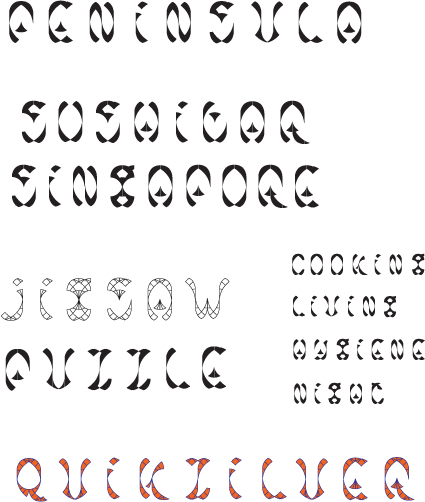
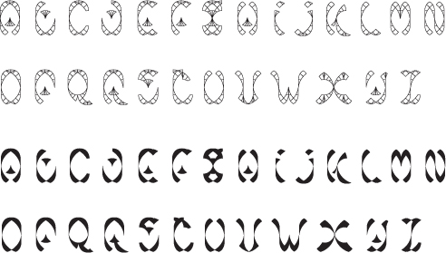
I created a semi-capital font in almost the same type of grid, slightly more complex now.
The result are some written-like, quite decorative lettershapes.
I really like the fluidity of some of the shapes, where others tend to be stuck in the grid and bear strength when standing on their own.
I have attached a file with the font on it, including my work method.
Below you can see a sample. Any comments, ideas, advice?