hi all,
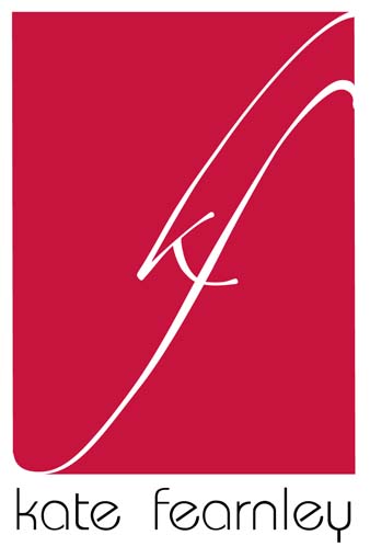
I’ve been playing around with a logo for a clothing shop for women (mainly at the moment).
Most of the colours of the shop are red and the previous logo was the name of the owner in KuenstlerScript.
She wanted something charming with swashes and I think that it does work well with most of clothing she sells, however she also (when she has time) likes to design very modern dresses and skirts and stuff.
I asked her if it would be alright if I work on a logo for her as a part of a university project, which was fine.
Well...so I wanted to make a modern looking logo which would still have a swash to make it a bit more charming and feminine.
The logo isn’t finished yet but this is just a first try and I was wondering what people here thought about it.
I decided for a very light font for her name underneath because otherwise it just took too much attention away from the logo.
I wanted the format to be able to fit on a tag (the things that are in the neck of shirts and stuff...not sure what they are called at the moment...(english is not my first language).
Again as always —-> thank you all so much!
dav2.
just made some changes to the whole in logo 4. (btw..I changed the size hoping I could add it with ’insert image’ but didn’t work).
I have changed the type also to universe ultra light (I have been looking for different very light fonts because anything too bold will pretty much take over the whole of the logo).
| Attachment | Size |
|---|---|
| logo3.jpg | 50.2 KB |
| gradient ins.jpg | 239.13 KB |
| blingbling.jpg | 408.7 KB |
| logo 4.jpg | 56.64 KB |