
While in Boston at TypeCon last week I came across a window display that caught my eye. Turns out it's the work of UK designer Si Scott. Its beautiful, hand-drawn type with all the nuance of great lettering.
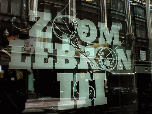

While in Boston at TypeCon last week I came across a window display that caught my eye. Turns out it's the work of UK designer Si Scott. Its beautiful, hand-drawn type with all the nuance of great lettering.

This style is wonderful!

Delightful!
Wish I had seen that one, I might have stopped in for a well lettered pint ;-)
ChrisL
Actually Chris, it was a sporting goods store... note the basketball in the first O. =)

wow! that's really wonderful. Loved the style.
Slam Dunk! and the name "Lebron" should have been a clue too!
Don't ever get old Joe, you start to see mirages everywhere :-|
ChrisL

Reminds me a bit of Patrick Griffin's Heathen
A really cool design - I wish I had had that idea!
Thanks for the link Tim.

art nouveaus return :-)
--astype.de--

Dav
=)
Captured from commoncrawl.org on 27 Apr 2015. original URL