Hey gang,
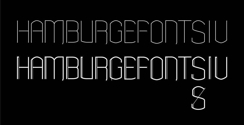
Just looking for some thoughts and opinions on this. I finally got some ideas from paper to Illustrator.
Its also my first real forray into type design so go easy on me!
Thanks!
| Attachment | Size |
|---|---|
| test.jpg | 76.03 KB |
Hey gang,
Just looking for some thoughts and opinions on this. I finally got some ideas from paper to Illustrator.
Its also my first real forray into type design so go easy on me!
Thanks!
| Attachment | Size |
|---|---|
| test.jpg | 76.03 KB |

Interesting take on a quasi-rubricated modern sans. I'd move the rubricated mark over more.

I would consider making the 'bites' in the right side of the B & R deeper to help the letters differentiate. There is always a balance between making letters belong to each other & making them individual. You have maybe gone too far in making them match too completely.
Thanks for the advice guys,
I agree with both of you!
Hopefully ill have some time to play with this some more and post an update.
Cheers!
Captured from web.archive.org on 19 Apr 2015. view this capture