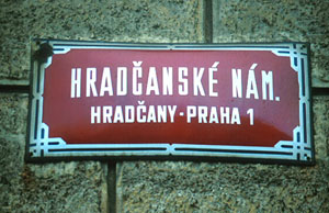
Hi there
Does anyone know what typeface is used for road signs an street names in Prague?
| Attachment | Size |
|---|---|
| Strassenschild.jpg | 45 KB |
Hi there
Does anyone know what typeface is used for road signs an street names in Prague?
| Attachment | Size |
|---|---|
| Strassenschild.jpg | 45 KB |
There is probably no digital font to match this lettering. You can approximate it with Agency, Herald Gothic, or URW Bee.

Hi Thomas
Odeon Condensed comes pretty close. I think it was produced by Hoefler & Frere Jones, but seemingly no longer available (http://typophile.com/node/13735).
Also the old Grotesque Condensed No.77 (Monotype, Stephenson Blake) which, like the Agency Gothic, has a high square bowl on the ’R’ and a stepped (almost horizontal) spine on the ’S’. Also (like Agency) it has an ’M’ in which the centre strokes descend to the baseline – which is unlike your example from Prague. However it may not be available as a digital face.
I think Neville Brody’s Industria does the same thing with the stepped midsection of the ’S’ and it does have a high centrepoint in the ’M’.
Stephen - while you’re mentioning Bee, do you know what is the relation between URW Bee and Binder Style (which might have been by Joseph Binder 1959 for D Stempel AG)?
I thought they were the same face... but I could be wrooong : 0
I don’t know. I wish URW offered more background info on their fonts.
thank you!

Apparently, Dave Darey designed ’Azbuka’ and is derived from street signage in Prague.
http://www.faces.co.uk/type_talk/the_story_behind_azbuka.cfm
Nick Cooke
Farey, though I saw him at TypeCon walking around with a Nick Shinn nametag.

But ’Azbuka’ doesn’t look like the sample, or am I looking at the wrong thing?
- Mike Yanega
This version of Raleigh Gothic has the closest combination of letterforms I have found, but the letters, like C and S, are not as closed.
- Mike Yanega
Nice one Mike – Raleigh Gothic with that BOX for a bowl on the ’R’. I should have twigged that connection the moment Stephen posted ’Herald Gothic’.
BTW, I should have been referring to a Josef Binder in my earlier post - and I’m pretty sure that there’s a version of URW Bee going by the name of Gallileo. Anyone care to corroborate this?

Ben - I can tell you, thanks to Philippe on the MyFonts Forum, the derivation of the Bee naming. This came from the old VGC aphanumeric naming. The URW Bee fonts correspond to VGC’s B-1, B-2, B-3 and B-4. There were heavier weights up through, I think, B-11. I know of no digital version of the heavier weights.
These VGC types were themselves copies of someone else’s type (I wish I knew what foundry) - which had ’G’ names like, respectively, Galaxy, Gable, Garfield, and Gamma (and so on for heavier weights).
Note that these are NOT the same as Binder Style/Binderstile. Just take a look at the “corners” of any rounded character and you’ll see that Binderstile is considerably more squared off.
Wow. Thank you Mike (and Philipe) for your research. That had bee puzzling me for years...!
Apart from the rounded corners, I presume that the structure (stepped midsection ’S’, boxed bowl and straight high leg for ’R’) is very much the same as both Binder Style and the Prague street signage?
General structure I suppose is the same. As far as similarity to the street signage goes, Binderstile would be closer and is available digitally in two weights both from Castcraft/Opti (I’m told) and from QBF as the old Brendel fonts Report Light and Report Bold. As you can sort of make out from the crappy showing, Binderstile still has lots of differences, including that R and an M that is, like all the other fonts mentioned, nowhere close.
The only thing I find in predigital catalogs that was quite close to the signage (based though on a very limited showing - but that R is there) is something called Enge Wotan - and I know of no digital version. Anyone have a decent showing?
Hey Mike. Ah yes - it’s that wacky lowered crossbar on the ’t’ and the ’f’ that is the distinguishing feature for the Binderstile. Thanks for the reference. In that the street signs are all caps, this might work for Thomas.
My reference (Jaspert’s Encyclopedia of Typefaces 1958) for Wotan Bold Condensed (and perhaps not the same as Enge Wotan) shows a face that is similar to the ’R’ only; the ’A’ and the ’M’ are quite different to the Prague street signage.

A digital interpretation of Wotan might be Aurora.
Captured from web.archive.org on 2 Nov 2008. view this capture