Typophile

Web design agency icon Logo Type design

jeanlou

Hi all!

Need some comments about that:
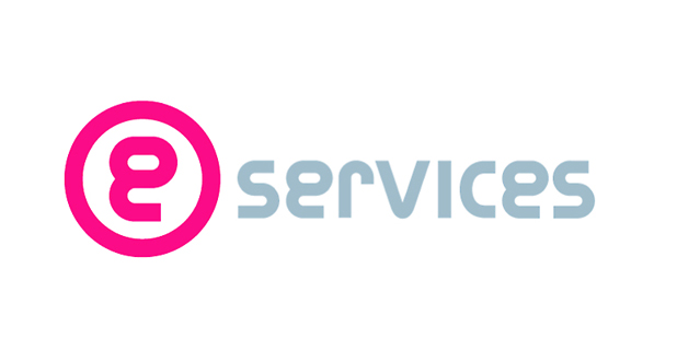
To get you into the picture:
I've been ask to redesign the Identity of a web design, development hosting, marketing etc. company based in mauritius (www.eservices.mu). Its a small agency aiming high, they want to be the leader in the sector in mauritius and looking forward to export their services. They want to be seen as professionals, reliable, proactive and responsive.

This what i've come with.

What do you think guys?

Thx

Jean-Lou Désiré

the logo looking pretty nice ..but im not satisfied with the alignment of the word "serveices"..as its neighter in the center of the circled "e" nor in the aligned to the bottom of the same(e). and thats y its looking a bit unbalanced. And the circled "e" is too big. You have just scaled up the normal proportion of "e" to make it bigger..try to reduce its thickness to the thickness of the word"services".

Satya

sorry, I pressed the 'post comment' button twice..

at first I couldn't figure out whether it's an "e" or a "g" you might want to work on that.. besides that I'm with satya

-mike

the e wasn't readily identifiable, but I'm not sure if that matters. It's certainly readable within the name of the company.

That said, I read it as 'services' with a round logo.

You might want so spell out 'eservices' completely.

Of course, I'd suggest they pick a better name than 'eservices'. That's sort of like calling the company 'web design'. But I'm guessing that's a different battle. ;o)

lol. Unfortunately I read the company name as "services" and the circle thing just looks like a logo mark with a letter g in it.

oh yeah! I didn't noticed that..the circled 'e' is really looks like 'g' at first sight, if someone dont see the word services first.

>>To solve this, you can use the letter 'c' to make 'e'.

-I wanna see the letter 'g' of the same typeface. Can you show me?

satya

You could simply make an uppercase E, by trimming the right of the lowercase e. Also you could look at the r, whose form is making a large space with the v, maybe cutting the curve and closing the rvi kerning. Ultimately the look is attractive and fairly modern, I think this logo will date fairly quickly, which I suppose is part of the nature of the business it is serving.
Tim

Im fully agree with timd. you can solve your all the confusions just by making the 'e' capital..anyway your all letters looks like caps except 'e' and 'r'. I'll say make 'r' capital too..so that the white space between v and r also get balanced.

hmm sounds good, cap R and E and it'll be much improved.

Thanks all, I'll work on it, I do agree.. it seems that there is a real issue with the 'e' that look like a 'g'.

I'll post the modif soon.

Satya: I havn't got any design of 'g' yet.

At first glance the 'e' seemed to me a modified '8'. I also agree with the earlier post about spelling out e-sevices. If I hadn't first read your post, I'm not sure I would have made the connection between the mark and services.

The issue is that a capital E isn't what the world uses for 'e-whatever'.

email, eMac, eBook, eCommerce, etc.

the lower case 'e' (as well as the 'i') have come to mean 'we're an internet company'. Cliche, indeed, but if you are going with the cliche, one probably needs to stick with it, and keep it lowercase.

Here is some work in progress...


I am quite tempted to leave the 'e' out of the ellipse!

Could be something like that:

jeanlou...the first one of your revisions is the one to go with, as it definitely reads as an 'e'. The others still have that ackward hump that distort the character enough to not quite look like an e.

What about this one?

Your latest one could prove to be problematic because the dot does not appear in your URL, and the the big 'e' looks too light.

I still think the first one from three posts ago is the best so far.

- Lex

I quite like this one actually...

final Thx all! i've posted logo at: www.jeanlou.net

Captured from web.archive.org on 8 May 2012. view this capture