
In the book 'Stop Stealing Sheep...' Erik Spiekermann describes Univers as the cool alternative to Helvetica. Why is this?
In the book 'Stop Stealing Sheep...' Erik Spiekermann describes Univers as the cool alternative to Helvetica. Why is this?

Maybe because it's cool not to follow the masses (?)
I just can't see Univers being characterized as "cool"... more of a bread-and-butter, nuts-and-bolts kind of thing, right? As in not very glamorous or sexy. I'm mean, we're talking about the typeface on the "Yes, we're open!" signs here.
Helvetica can be very cool or very boring. It's cool when you use it where people don't expect it.

You could ask Erik what he meant. The chart with all the different weights and styles is pretty cool, even now.
I must agree with Sii,
The Univers Chart is so cool, and has been used by many other typefaces to show off the weights.
The Table is a piece of artwork in itself. I am not really a fan of the word 'cool' but i guess if a typeface can have such an effect on people without even trying, then its pretty cool
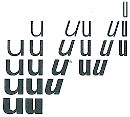
It’s not just what Erik meant by that statement, (I don’t really want to push him on the issue, but if he’s reading this and wants to respond...) And, yes that Univers chart is a classic.
Do any of you typonistas think Univers somehow superior/preferable to Helvetica in either a technological or aesthetic manner?

im not as experienced as others on here (probably even younger than you, im 20) - but for me, univers is near the perfection of the neutral grotesk model (for me, helv and univers are neutral - AG has character). if a typeface is superior to another if its even more neutral - if thats the goal - then yes, univers is superior.
maybe, erik meant with "more cool" -> more neutral. less character in its shape, more neutrality.

I think Thierry's probably on to something...
--Michael.
------------------------------------------------------
// love what you do or do something else. //
Michael Ebert -- graphic designer, jazz saxophonist, horror movie devotee
http://homepage.mac.com/mwebert
mwebert@mac.com
--------------
I would like Univers more if there was a few more "weighty" alternatives in the condensed and ultra condensed range. That's certainly a market which HTF Knockout is taking full advantage.

Univers has been called many things. Among them, the coldest typeface of all. I believe that Mr. Spiekermann was referring to Univers as being more neutral than Helvetica.
The cool 'cool' alternative to Helvetica, at least in my opinion and in the present day, would be the ubiquitous jobbing sanserif.

Hi Henry
To get to the heart of Spiekermann's statement, I suggest you try setting the same text, preferably one in a foreign language* (maybe a hundred words at about 9 point and with a reasonable line length and leading value) in both Univers and Helvetica; print them out and compare them side by side. As you look at them, try and gauge them in relative terms of function, temperature or visual edge - which of the two appears to be more rational or more humanistic? which appears warmer or cooler? or softer or harder?
* if you can't read it for sense, it will help you look at it objectively.
I gave up long ago on expressing a preference for either one of these particular faces, but there are many typographers I know and respect who feel passionately about these things. There are also many alternatives to both Univers and Helvetica, since we are now nearly fifty years beyond their original release dates. Having said that, Bram's oblique reference to AG should not go univestigated.
I'd say AG has a bit more character. Univers definitely has a cooler, more precise appearance. Probably most appropriate for use in government publications. ;)

A new alternative to Univers Compressed, which you might like, is TypeTrust's Heroic Condensed.
Miss Tiff, I got the TypeTrust newsletter as well, but was it really worth pulling up year old threads to promote the typeface? (Sorry, if this sounds harsh, but seeing the typeface named in 'quite a few' threads now, just makes me wonder. Don't get me wrong, I really like the typeface, I just don't get the aggressive promotion 'strategy', naming it in every single 'Univers' / 'Condensed/Compressed' thread.)
Dav
And I may second BJ questioning the very same thing in one of the several other threads. (I am counting 8 identical replies / mentions, by the way, so far.)
Dav

I was not trying to be harsh either; just curious ... :D

Yesterday I got the Linotype newsletter celebrating Adrian Frutiger’s 80th birthday. Amongst other things, there’s an article by Akira Kobayashi on Univers vs. Helvetica. You’ll see how Univers’ spacing is much wider than Helvetica, which supposedly makes it more fit for text settings. More open counterforms and finer details give it that sharp look, which may be perceived by some people as overly “cold” – but not to me.
(As a side note: Linotype’s Web site is terrible, I tried finding that article and could not figure for the life of me where they put it. I ended up going back to the newsletter, in frustration).

That article is indeed good. Nothing like Akira writing about Frutiger.
Does Frutiger have an autobiography among his books? If not, I hope someone is getting his story down; his fifty years in the industry would make an interesting, if nerdy, read.

Wonderful idea -- we can all follow Univers and Herr Spiekermann will then recommend Helvetica as the cool alternative.
James, Linotype has a DVD called The Man of Black and White - Adrian Frutiger that is quite interesting in that it touches other aspects of Frutiger’s life apart from type design. It’s not too long (about 40 minutes) and I quite enjoyed it. As far as I know this is as close as it gets to a biography, but keep also in mind that the man wrote a lot of books: I recommend you try to find a copy of Type Sign Symbol through some library, it’s impossible to find one to actually buy. Mark Simonson also posted some pictures from the book in his recent Frutiger talk.
Alright. Alright. It was late. I was tired. I thought it would be nice to promote the new typeface. No need to be suspicious. It is me, after all, not some random person selling yarn made from dog fur. :^P When I come across a typeface that reminds me of an old thread I'll usually go back and add my suggestion. It just happens that this time I did it quite a few times. And besides, who cares if an old thread is revived? Did it cause a ripple in your life today? :^P

Miss Tiffany is not on the TypeTrust payroll, but we always appreciate her enthusiasm.
:)
If there's anyone to Trust in Type, it's Tiff. (I wrote that last night, but didn't post it b/c it's corny. But true.)
I just found myself curious to know if there was some backstory.
cheers


No backstory. I just became, perhaps, a little too enthusiastic. I'll try to keep it under control. O:^)
I just can’t see Univers being characterized as “cool”... more of a bread-and-butter, nuts-and-bolts kind of thing, right? As in not very glamorous or sexy. I’m mean, we’re talking about the typeface on the “Yes, we’re open!” signs here.
Oops! I was thinking of Frutiger when I posted the pic of the Concorde, but I think the idea (and shape) stands. Frutiger is French-ish, to use an absolutely awful expression that I may have just made up. Univers is not some old German clunker, it's sleek, new, sexy, and yes, cool...in a late 60's French-sort-of-way. It's power was in what it replaced, which is hard to know about today.
I could also make the jab that Univers is to Segoe as Concorde is to Boeing 787. Some Boeing fans might interpret that comparison favorably, although I mean it ambiguously. Newer is sometimes better, but not always.

When googling an issue that is several years old it's surprising to find some kind soul was nice enough to update it with more relevant information. Kudos to Tiffany's librarian instincts. ;o)

Honestly, the Frutiger DVD is terrible. Very boring and uninteresting. When you have seen a documentary like Helvetica, then what is possible to do with such an artist, it's a pity. As of the biography, It actually exist in french language, the title is "Adrian Frutiger; une vie dediee a l'ecriture typographique", and it is a great, 128 pages book. I suggest some of you convince an american publisher to get the translation rights from Atelier Perrousseaux.
http://www.adverbum.fr/index.php?&moid=12&oid=T001:273ff8d398d29b21f7788...
dr

"Helvetica is the jeans, and Univers is the dinner jacket." --Adrian Frutiger

I've heard over ad over from designers in my area that their default body copy choice is Univers. Their reason for choosing such is that they consider Helvetica totally clean and neutral, but Univers is *almost* helvetica, but not quite.
I think it's that tiny bit of cayenne pepper in the pot of spaghetti sauce that gives it a slight kick - it's not much but it doesn't have that skeleton feel helvetica can often have.
Maybe that's what he meant…

Like Helvetica there seem to be so many rip offs of Univers - that we haven't seen a good version in years. I hated it when Adobe released their version - and used a "common" ampersand, instead of the distinguished ampersand Univers was known for.
Captured from commoncrawl.org on 28 Apr 2015. original URL