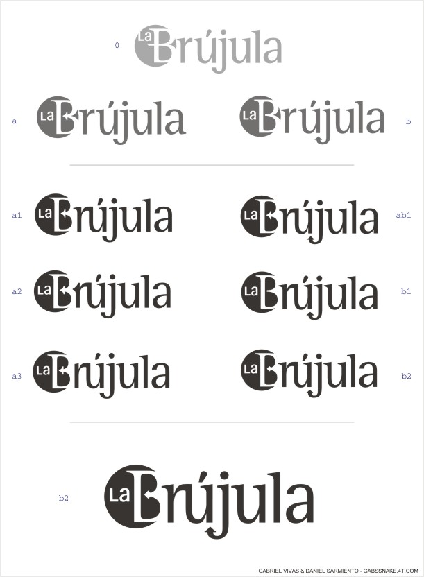
Hey, Im currently with a comitee whom will be working on a magazine for my college (University Jorge Tadeo Lozano. Bogotá, Colombia).
[ Please view the image before reading more, so you can get a *clean* first impression ]
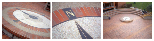
It is going to be called "La Brújula", which in spanish means compass; and is meant to represent the one artifact pointing a desired direction, the intention of going that specific somewhere, as well as an existing architectural "spot" in the college called that way (were students wait between classes, read, talk, get together, etc).
It is meant to be a young but still institutional publication (will be writen and design by students only), showing the variety of characters in students and the collage 's will to be in constant change, for the good. It was created so students start to feel more like a community.
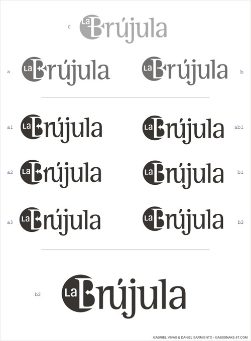
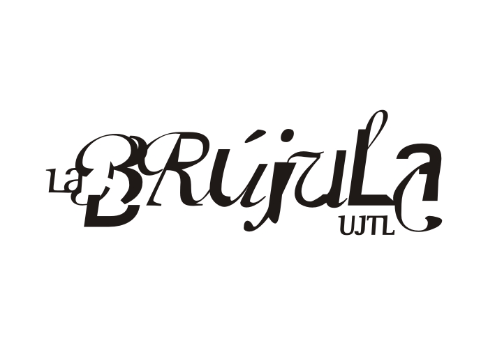
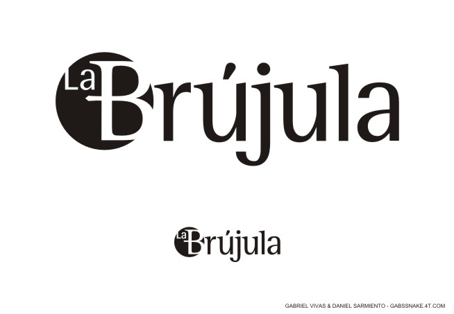
After some discussion, we'll be using Afga Rotis "family" for the publication (Serif, Semi-Serif, Semi-Sans & Sans-Serif, with their variations), so I started from the semi-serif. There is a version for small sizes, in which "La" is bolder; just an idea.
Critics, comments, suggestions: All welcome.
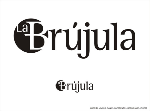
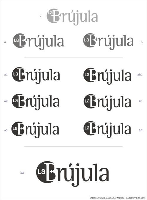
PD: This first version is a collab between Daniel Sarmiento and me, not yet official.
| Attachment | Size |
|---|---|
| labrujula.jpg | 25.07 KB |
| labrujula02.jpg | 65.38 KB |