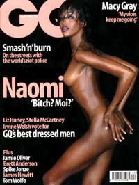
(a bit of fun)
What is everyone's favorite magazine masthead?
They can be from current publications or from old.
How about...

(a bit of fun)
What is everyone's favorite magazine masthead?
They can be from current publications or from old.
How about...

Hi there: Looks like an alteration of ITC Souvineir.
Funny, I can't seem to focus the masthead too much when the beautiful Devon Aoki is on the cover.
Mikey

Maxim, of course - taken from the 4th line of the Trajan's Column inscription.


i love it.

Funny, I can’t seem to focus the masthead too much when the beautiful Devon Aoki is on the cover.
You have to give yourself some time to develop your typophileness to the next level. So don’t worry, after a couple of years or so naked people won’t distract you at all.

I've always liked Rolling Stone's:
- Lex
Look what you started, Jem.

I quite like the logo for POP magazine. I have a couple of books with the logo, but I can't seem to find it on the internet (it's quite hard to find anything about pop magazine on the internet!...why!!?)
dav.
Avant Garde Magazine head

> I’ve always liked Rolling Stone’s
Which one? I read the RS 1000th issue, and they note that the logo has changed two or three times. The current one is a somewhat cleaner version of the first.

Gotta go with 'Mother & Child'.
Although 'The Face' is cool too...
> quite like the logo for POP magazine.
Love pop:

Dutch by Swip Stolk

Neut by Alt designers
Not to forget Brutus or Casa Brutus.

:D


Have to agree that POP is a great logo. Like the Neut one, too!
I quite like the grafitti style logo used on Vice magazine. (And shoch horror - the cover has a naked lady on it!)
Not quite a masthead, but I've always liked the type used for the Final Fantasy game series. The illustrations always work well with each release, too.

Here's a Final fantasy example.

No here it is!

its more the fotos than the masthead itself, nzz folio (folio is the monthly mag of neue zurcher zeitung).
some examples:

subject of the mag: "Men"

subject of the mag: "At the dentist"

subject of the mag: "Pills"
- sorry, dont have any bigger images..
> NZZ Folio very nice images indeed.
Always loved Sunset.


Oh, I love Sunset. that version and the latest one are just so good!

The old lettering for 'Sunset' is so much better than what they have now. And so is the photography if what's on their website is anything to go by.
I wonder if the old version would be even better if the 'S' joined the top of the 'u' instead of half way up?
They should switch back to the old style cos the new one is emotionless and slightly depressing in an early 90's mainstream way.

'Noodle Bowls'
Well, i don't know about you, but that's got me excited. Sheeesh.
> They should switch back to the old style cos the new one is emotionless and slightly depressing in an early 90’s mainstream way.
I think calling it depressing, is a bit extreme! I find it has the opposite effect on me.
I love that they went back to the original masthead from the 30's, albiet slightly modified.
That's a rare move these days.
Some Japanese stuff I like.


For an academic journal, I always thought this was quite amusing (sorry about the tiny image, but it's the only one on the publisher's website):

www.springerlink.com/link.asp?id=100250
It's called "Computer Supported Cooperative Work (CSCW)" in case it's unreadable...
__________________________
Ever since I chose to block pop-ups, my toaster's stopped working.
From my childhood...


I like the covers of the Betoni magazine. It is a Finnish magazine about concrete: building, tiles, bricks etc. The sublect is not very exciting, but the covers are always stylish.
"I love that they went back to the original masthead from the 30’s, albiet slightly modified." - Jem
It looks a bit more than slightly modified. Anyway, it feels like a committee managed to update the heart and soul out of it.
I didn't mean the new version is inherently depressing but that it's depressing they failed to improve on the old one and lost the qualities that made it worth reviving in the first place.
At least the revival is an improvement on the one i found from 2002...
I also found these while looking for pre-revival versions...

1906

1910

1927
The one from 1910 rocks :)
This one's new to me. I like it, a lot, i think.
Its appeal may wear thin rather quick. Hmmm, not sure.

I like the Juggs masthead. It wasn't enough to make GG look like a pair of breasts, they had to include JU in on the joke . . . and S if you think about it.
We all need to use the word torpedic more often.
Ray Larabie
Typodermic

Similar to Nova, I like http://www.demomagazine.com.au/ the format is pretty awesome too.
> It looks a bit more than slightly modified. Anyway, it feels like a committee managed to update the heart and soul out of it.
We will have to agree to disagree, I still think it's a great masthead.


pardon the crappy image. all i could find.
"We will have to agree to disagree, I still think it’s a great masthead." - Jem
I didn't say it wasn't a great masthead, just that i thought the revision didn't improve on the 50's version.
Sorry Jem, i just couldn't let this one lie.
When you see them side by side the differences are much clearer. Now i dislike the new one even more but i can see how it might be more appealing to the mag's present target audience and i suppose the revision justified an Art Directors existence.
Which one do you prefer?


Older is not always better, although I notice the US version now seems to use a drop-shadow which seems like over-egging the pudding, not wishing to contribute to the flood of testosterone I haven't posted an actual cover, so no pudding:)
Tim
Oh and this one, the interior design might have gone downhill over the last few years but the logo is still going strong.
Tim
> Sorry Jem, i just couldn’t let this one lie.
When you see them side by side the differences are much clearer. Now i dislike the new one even more but i can see how it might be more appealing to the mag’s present target audience and i suppose the revision justified an Art Directors existence.
Thanks for the comparison, yes the old masthead is better (although a bit dated now), eitherway, I still like the updated masthead as well.
...and to keep this discussion in perspective;
Edit: a new image may better illustrate my point.

I'm disappointed that this thread doesn't deliver on what it might have had it not spiraled into seeing who could post the most inappropriate image. :^/
> I’m disappointed that this thread doesn’t deliver on what it might have had it not spiraled into seeing who could post the most inappropriate image. :^/
I assume you are not referring to "Modern Ferret"?
It was never my intention to just show suggestive covers, these were the best images I could find by looking quickly online. In relation to this thread, I love all the mastheads I posted, that's why I posted them.
i dunno that is one sexy ferret...

Another older alternate Sunset masthead, seems it is ever evolving.

> Love DEMO, thanks.
I don't know, but I actually prefer the new version of the Sunset logotype (it's logotype right? One of my teachers taught me to never to refer a magazine's wordmark as a masthead), but that's just me.

Here's one I've been admiring recently:

I like the simplicity and directness of their covers. Just the logo and an image--no blurbs or anything. Too bad they have to have the UPC on it.
By the way, the Nova logo in the first post is Clearface with a lot of trimming done to it.
Maybe I'm too conservative. My favourites are very simple, very classic and, I think, very classy.


I always thought that for something as big as The Economist, they should have a Th lignature in their title. It's just something that's always bugged me is when I see T's and h's overlapping.
IMHO
In short sentences, in display settings, especially in short words, ligatures almost always call too much attention to themselves.
> In short sentences, in display settings, especially in short words, ligatures almost always call too much attention to themselves.
Yes, though it this case a ligature might help the Economist masthead look less like 'just a typeface' and more like an ownable logotype. It really is quite bland.
Great cover great masthead (...logotype ; )

I always loved Rolf Mullers HQ too.


These are really great.
Can I add that I meant in standard roman upright typefaces to my comment about ligatures? :^>

I'm dragging all of these into my Typography inspiration folder.


V Magazine.
I think it's an ingenious use of a logo. They always have stunning covers.


tried toget a picture up but my codings rubbish lol so heres a link
New York Times Magazine and a beautiful Black Letter T
vs.
Crash (v French no?)


Hi,
Very good examples here. I like "V" - is it actual magazine and where can be found?
What do you think about this heading?

This was a project of redesigned layout for hairdressers company mag (never released) done few years ago with a custom typeface I'm still workin' on.
___________
AL
www.lenart.pl
I like the hair fashion mag - let us know when you finish the typeface!
Has anyone noticed that the lass on Juggs looked similar to Juliette Lewis?
Aleksander, your masthead is so Studio 54, love it! thanks
(re.'V magazine', try Google, top of the list) ; )

MONGER


I never read the magazine, but the covers and masthead were quite nice. Alas, it's dead now.

The flag is very nice, but having the coverlines bleed to the edge is only a trick and not very logical.


What about Jugend? Was just reading up on it and thought it interesting. Although if the logo changed with each periodical I am not sure how I could label a non constant logo as a favorite... Except that it's change is one of the things I like about it.

Or Maybe Ver Sacrum:

typographische mitteilungen Is very nice as well. But I can't find any images of it on the web.
Alef
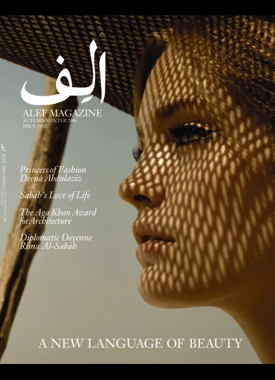

I still love the sixties EYE magazine

That Eye cover is hilarious!


I dig the current GQ masthead. That Nova one's a doozey.
NO magazine by Halvor Bodin. Fantastic.


I love NO as well.
I also love Toro.


@wormwood: The older Sunset masthead flows much better than the new. The new feels like a forced design that retains the older qualities into a new logo-type.


Captured from web.archive.org on 8 Jun 2017. view this capture